Big dreams with humble ends
Responsive UX/UI Design • Concept Work
Start Up is a national American docu-series television show created by Gary Bredow and is broadcast by PBS, Create TV Network and World Channel. The show is filmed all across America where host Gary Bredow conducts in-depth interviews with small business owners about how they were able to get their business off the ground.
The Challenge
While the message of the Start Up TV show is clear to anyone who has ever watched it, the meaning and intent of its official website is not. The website is very ad-centric, which undermines the entrepreneurial message of the show by shifting the focus from the small business owners to commercial-driven sponsorship. The end result is a website with a lot of valuable content that is obfuscated in a confusing layout of poor design choices. From a heuristic standpoint, there is plenty of room for improvement.
The Goal
After evaluating the website and its content, I realized that there was an opportunity to improve its message by addressing potential problem areas that could be uncovered through secondary research. If I could discover and identify these problems, it would be possible to improve the overall look of the site and improve its functionality at the same time. By making careful and informed design choices, the site could be transformed into a more inviting and maneuverable experience for the user.
Research Phase
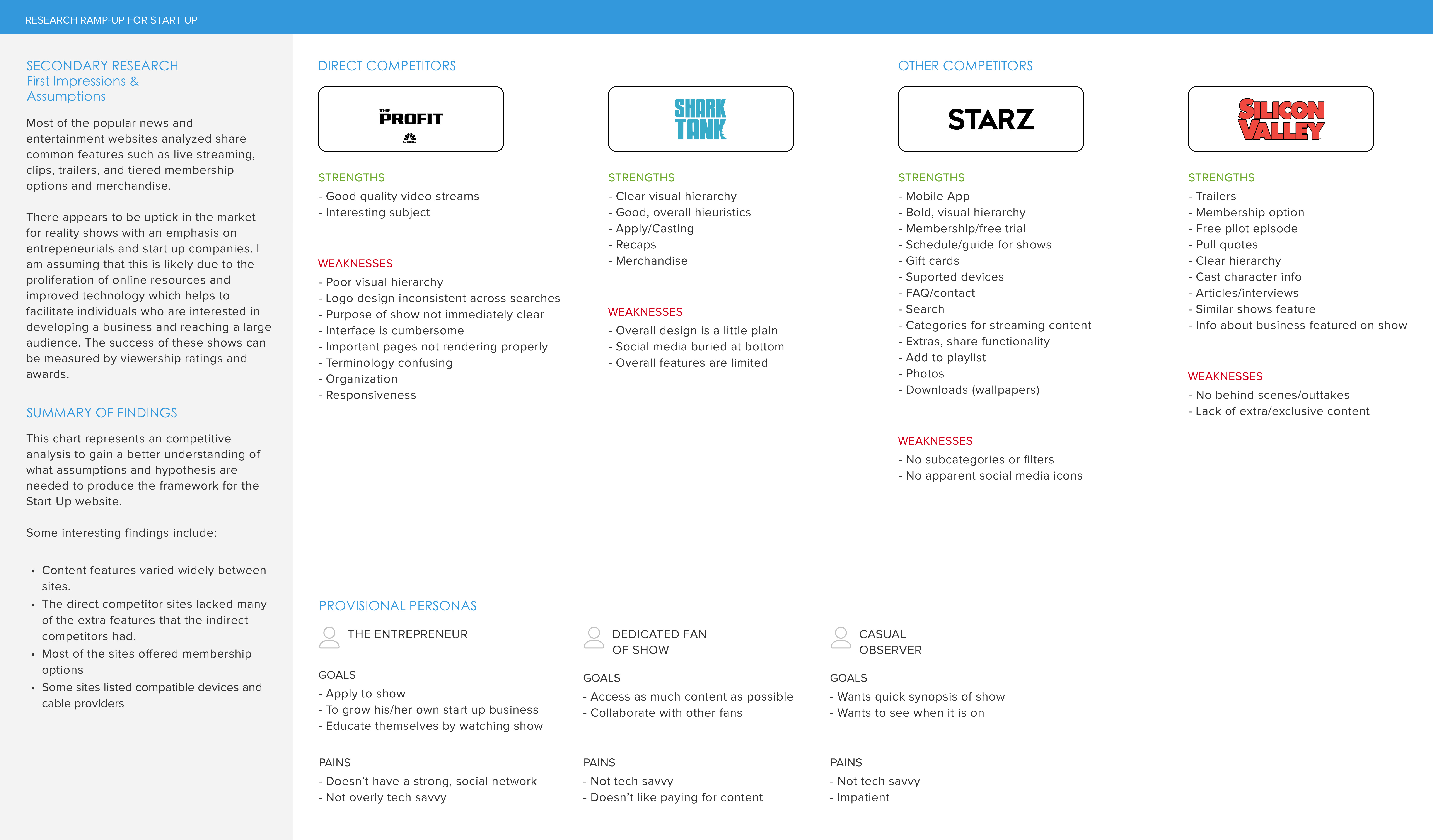
Competitive Analysis
I contacted Gary Bredow, the host of the Start Up TV show and one of my go-to stakeholders for the project. I asked him who his competitors were and why. From the list he gave me, I was able to analyze each of the competitor websites and draw up a chart to determine their strengths and weaknesses. With this information, I drew some assumptions about what features could potentially add value to the Start Up website and its customers.
Qualitative Analysis
The next step was to obtain feedback by facilitating a series of interviews with participants in my targeted demographic. Included in this group were participants who were moderately tech-savvy and who might have an interest in similar, reality-based TV shows about small businesses. I was attempting to identify pain points, desires, and needs in order to reveal problems areas that might need improvement or features that could be added to the Start Up site.
More Interviews
My first round of interviews revealed some pain points but nothing that was particularly useful or essential to improving the Start Up website. This indicated that I might need to change my approach, so I decided to push forward with more interviews. This time I went directly to the stakeholders and contacted the small business owners who had been featured on the show. I wanted to know what their experiences were. I asked them if they had ever visited the website, what impact (if any) the show had on their business, and if they had any complaints or suggestions about the experience as a whole.
Key Findings
My notes revealed the following problem areas for which needed improvement:
- "I don't know what time my show is airing"
- "I don't know which markets are airing my show"
- "A link to share my show on social media would be nice"
- "The website is confusing to use"
Define Phase
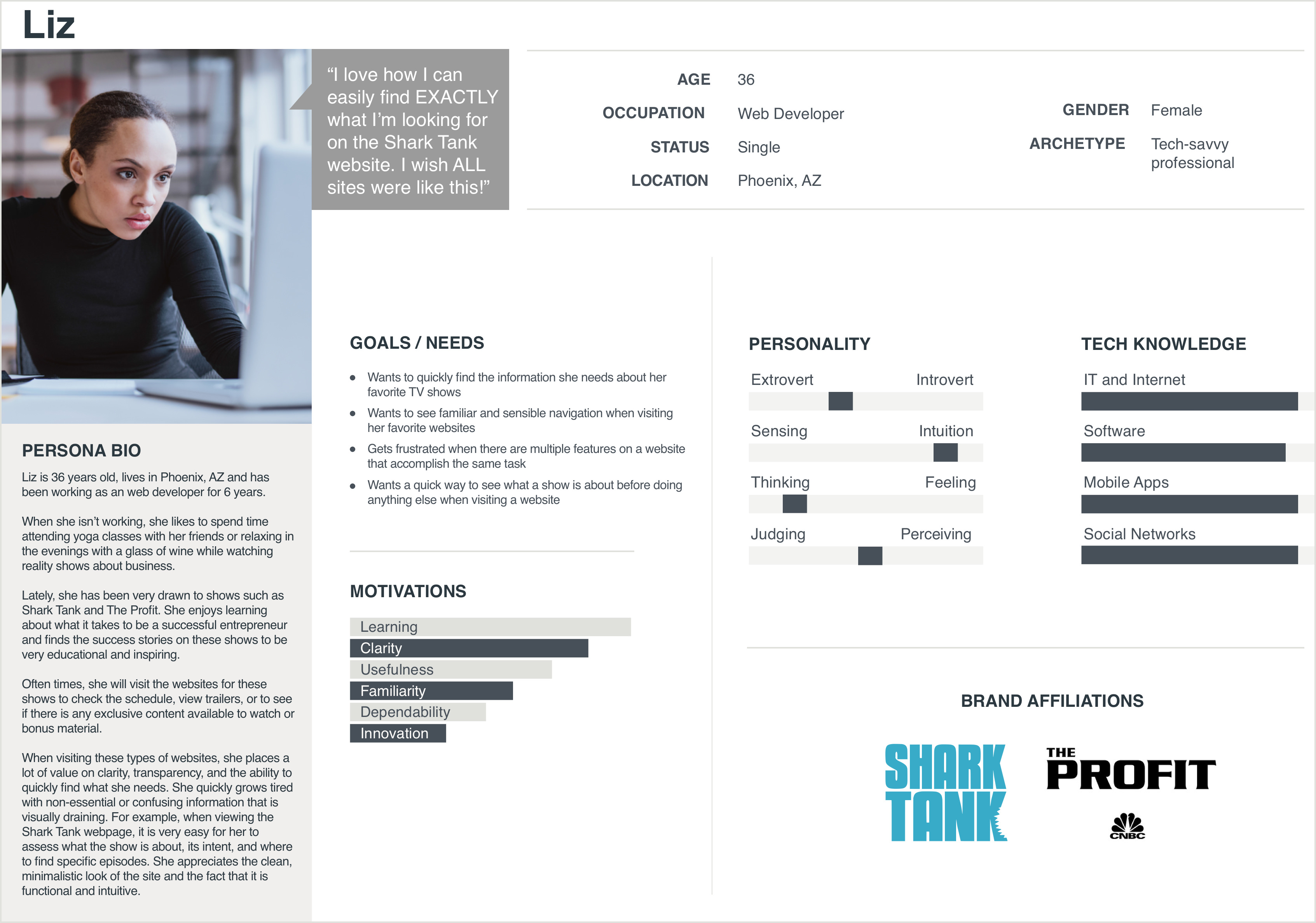
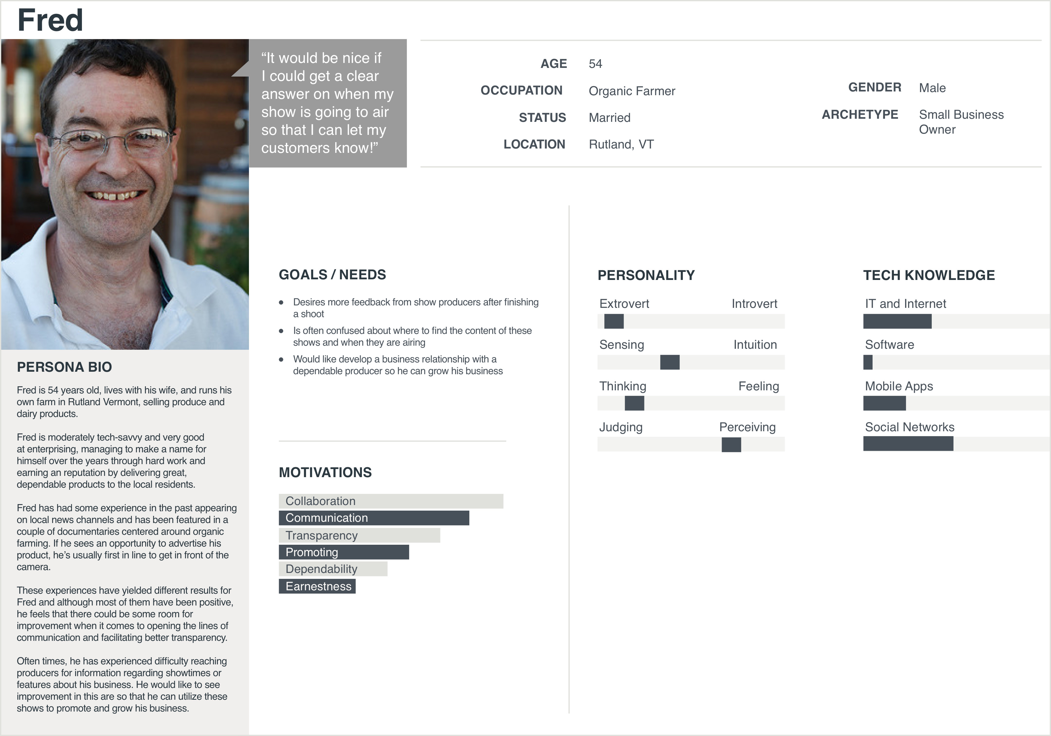
Personas
The next step was to develop a couple of personas based on the feedback from the stakeholders.
Liz represents a layperson's perception of the Start Up website. As a fan of reality business shows, she likes to seek out behind-the-scenes content. Her efforts to do this on the Start Up website prove to be a frustrating experience.
Fred is an amalgamation of the common complaints I received from my interview subjects. He has a real need to obtain critical information about when his show will be airing and in which markets, so that he can effectively share that information with his customer base.
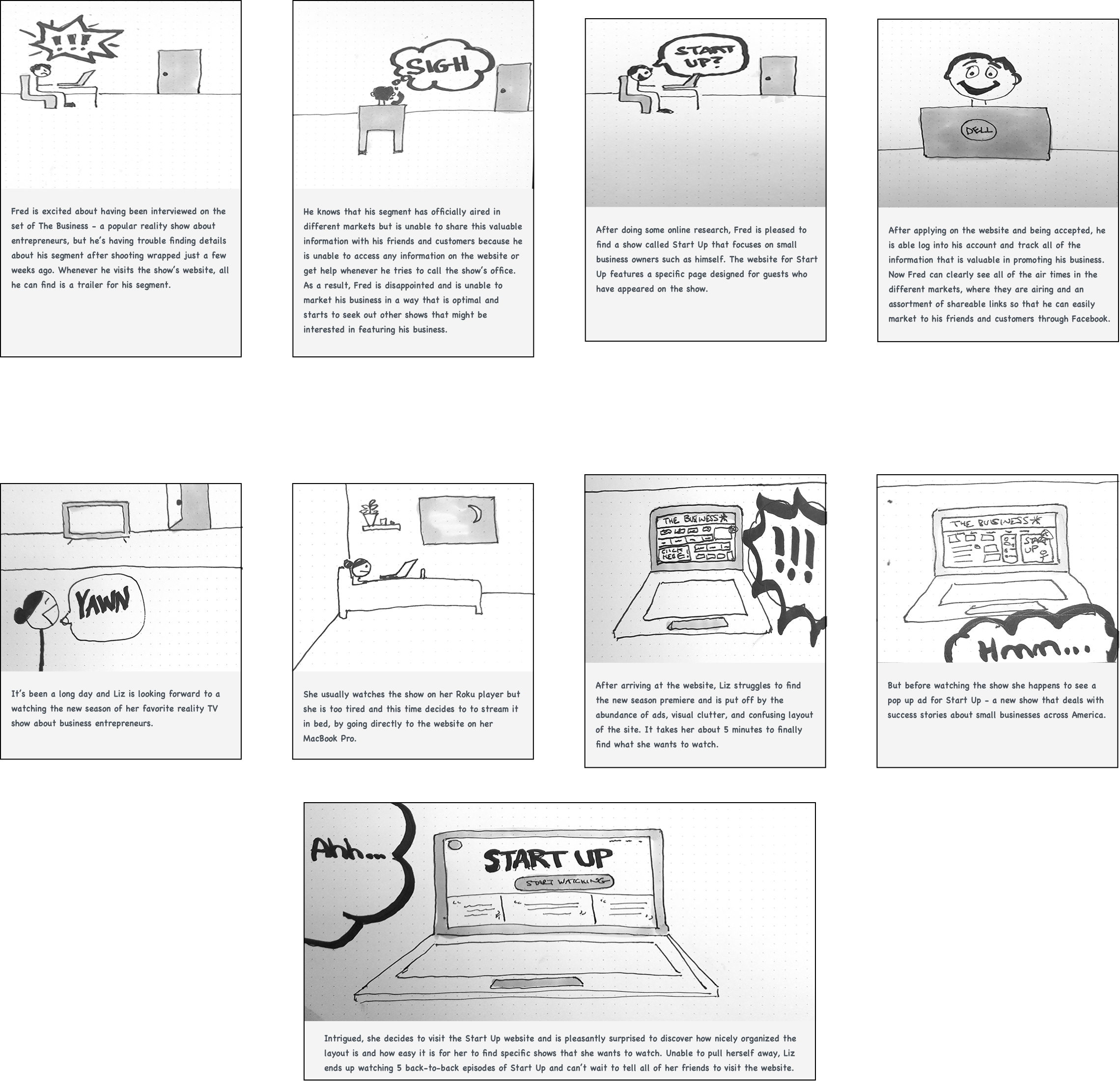
Storyboards
Now that I had two distinct personas, I drew a couple of storyboards so that I could illustrate their their pain points and desires in a contextual setting. Seeing how their actions might play out in a real world scenario helped to bring their problems into sharp focus.
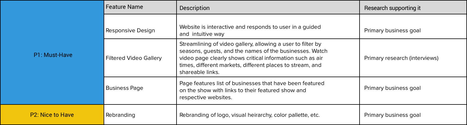
Feature Roadmap
Referencing the personas and storyboards, I set out to create a list of useful design features that would address the specific requirements for each personality. From this list, I prioritized each feature and considered their value to the stakeholders.
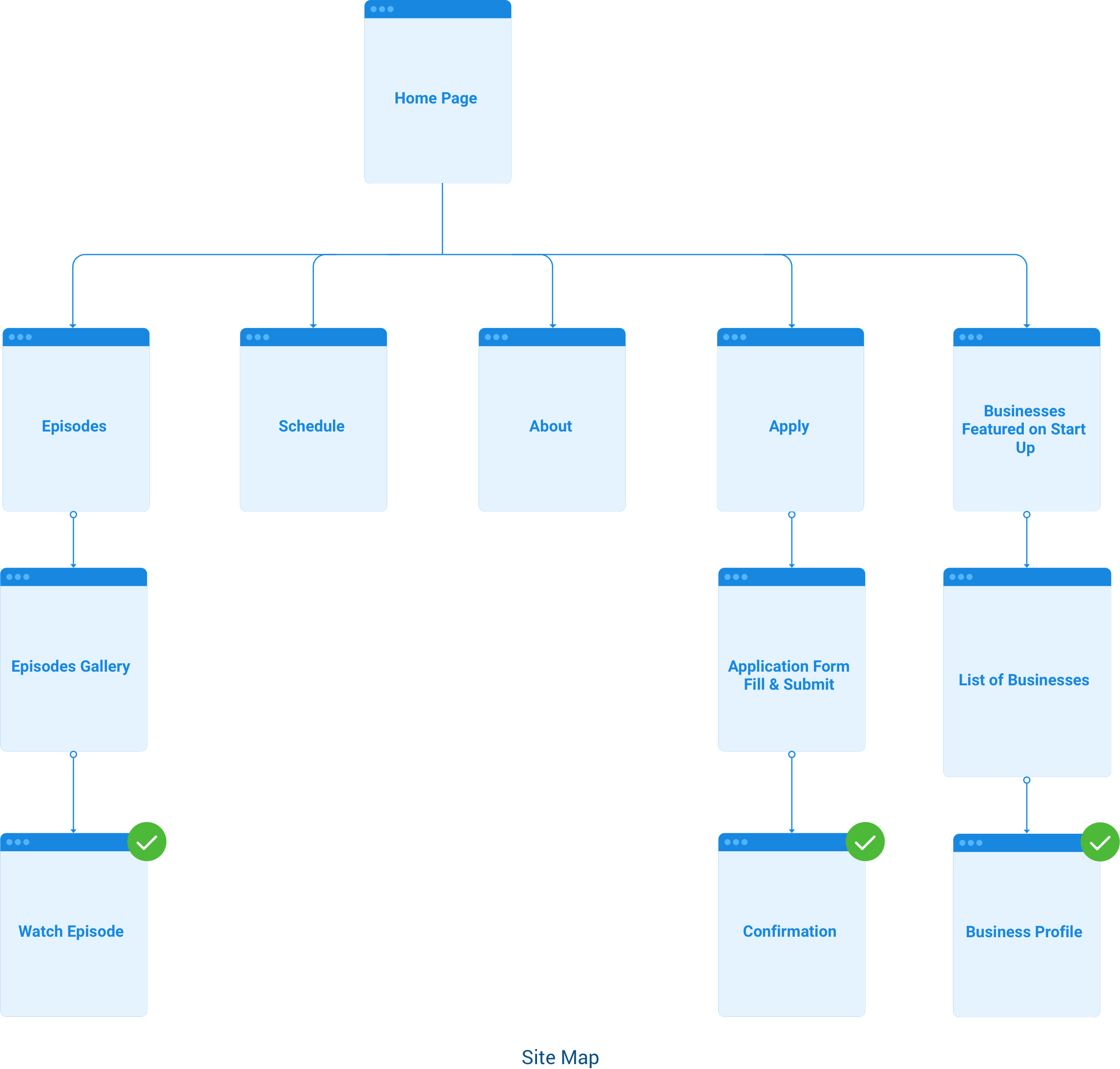
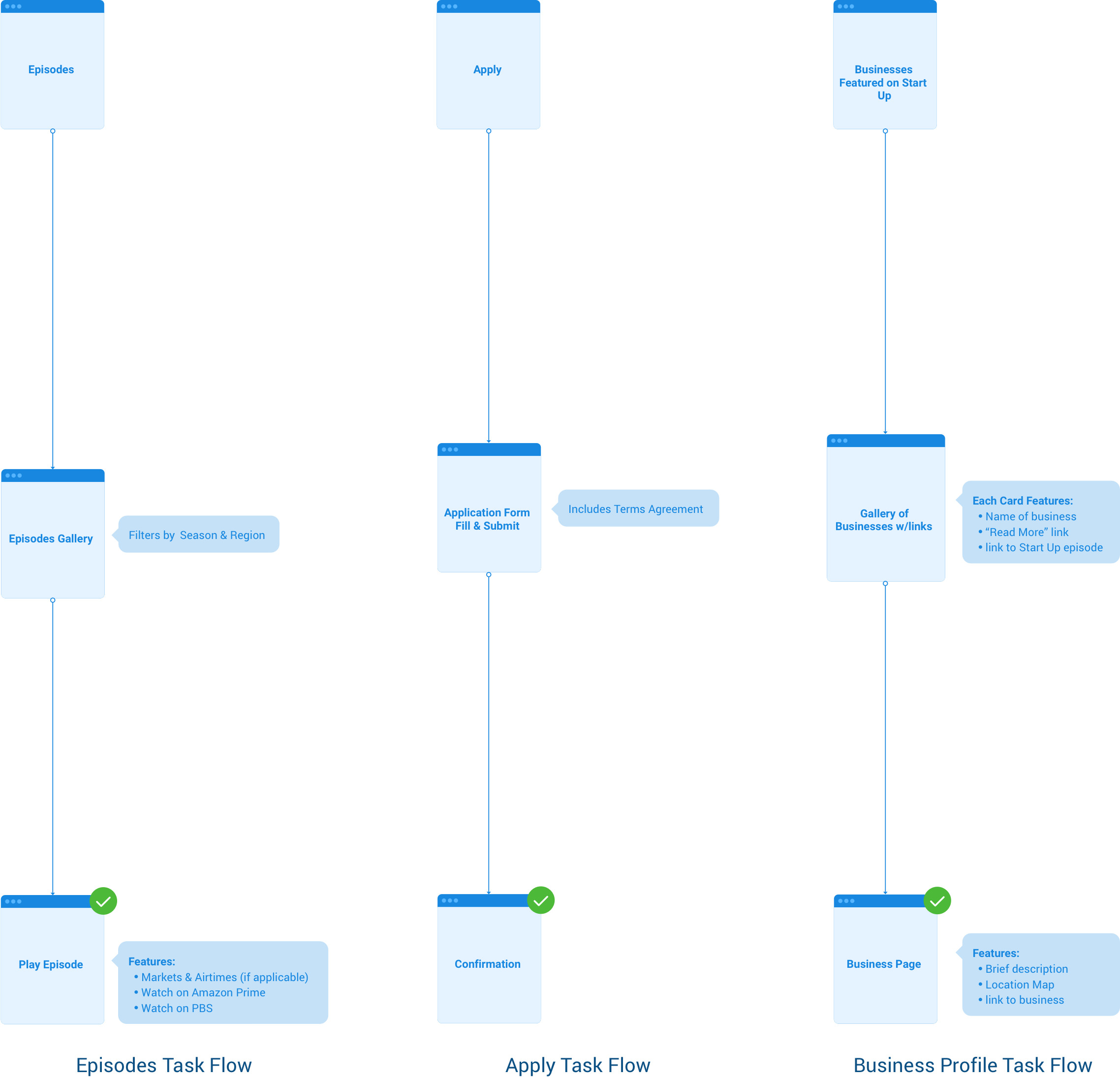
Site Map and Task Flows
From the feature road map, I combined the key navigation elements in a high-level site map.
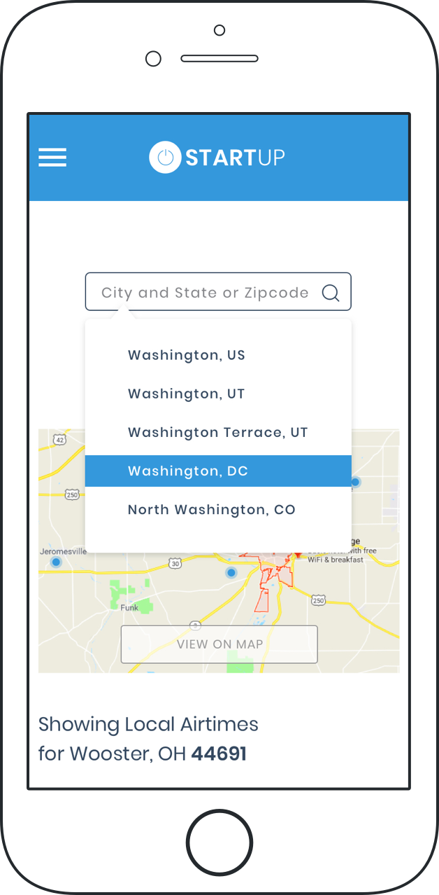
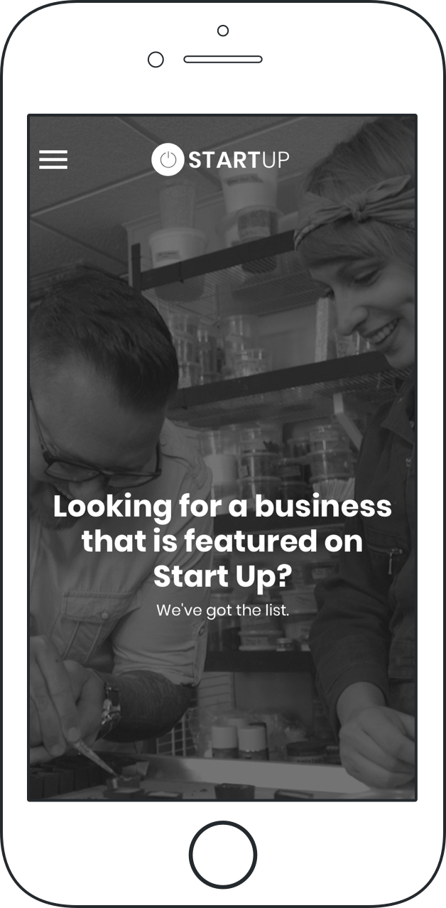
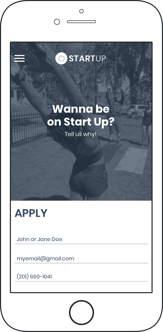
Then I mapped out the the specific task flows needed to address the problems uncovered in my secondary research. Included in the task flows were new features such as filtered searches, the ability to share an episode, and screens for showing airtimes and markets. For added value, I introduced an "Apply" task flow so that prospective business owners could apply to be on the show directly through the website.
Design Phase
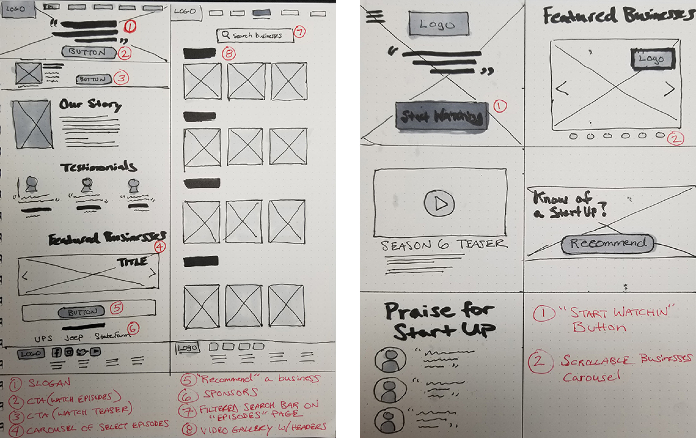
Sketches
From the task flows I began to visualize them in sketch format. I started by sketching some simple layouts for the landing and business pages. I included annotations for each sketch to indicate each element and its respective function.
Wireframes
Next, I created a series of mid-fidelity wireframes based on my sketches. This allowed me to get a better feel for the visual hierarchy and how it would appear when viewed in a browser.
Usability Testing
Now it was time to test my assumptions about the problem I was designing for. To prepare for this, I used InVision to assemble my wireframes into an interactive prototype which would be tested by a group of particpants.
Key Findings
The results indicated that most participants were able to navigate all three task flows in a speedy and efficient manner. There was some slight confusion that I attributed to both the framing of my questions as well as the appearance and limited functionality of the prototype. The following problem areas were noted:
- "Should I click Schedule or Episodes to find out when show is airing?"
- "Finding showtimes in my area is not clear"
Design Opportunities
- Improve overall navigation with high fidelity design
- Include multiple placeholder text in search bar to help find location
High Fidelity Design
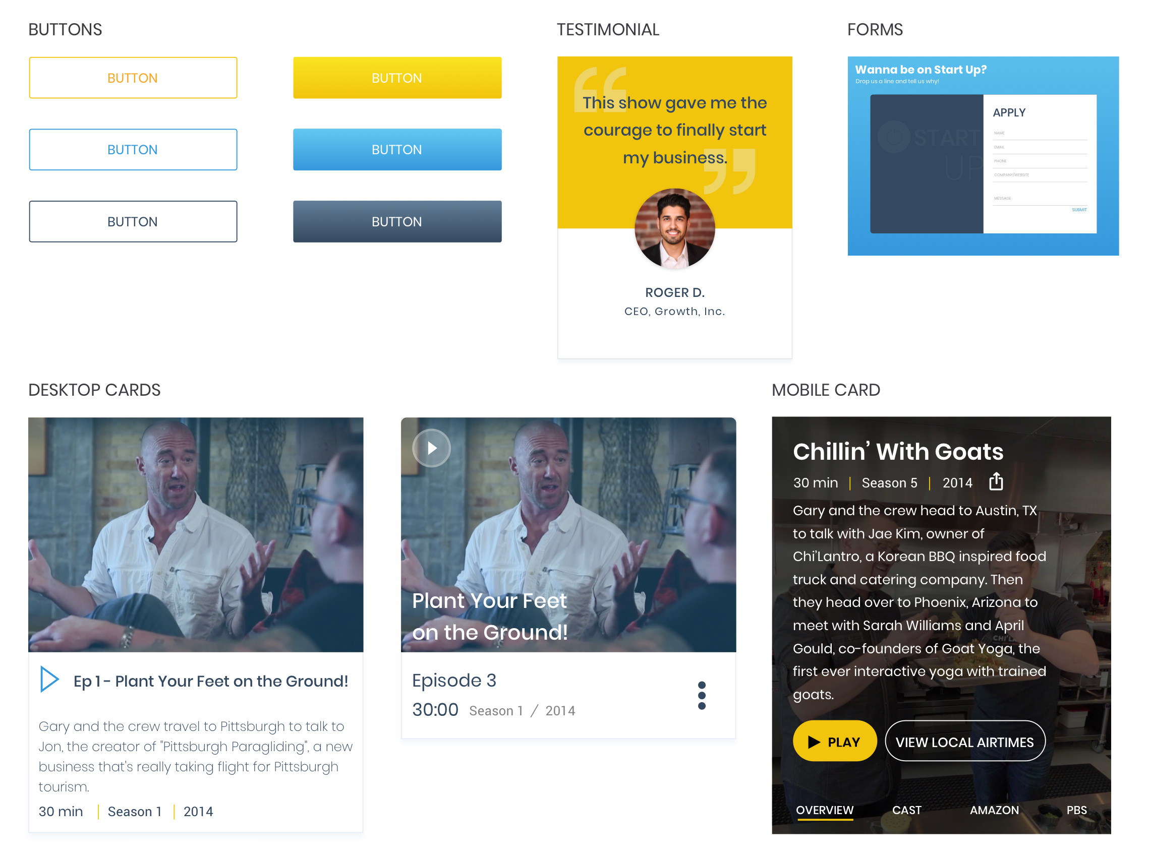
After evaluating the results of my usability testing, I set the stage for the rebranding of the Start Up website. Drawing inspiration from streaming platforms like Netflix, YouTube, and Hulu, I created a style tile and a redesigned the logo to help establish the final look and feel of the site.
Style Tile
I experimented with different card styles, buttons, and forms for use on both desktop and mobile platforms.
Logo
For the logo, I kept things simple. I wanted to retain the universal "power" symbol since it was already a recognizable asset to the Start Up brand. I played with positioning of the symbol and the font weights until I settled on the more refined and flat look you see on the right.
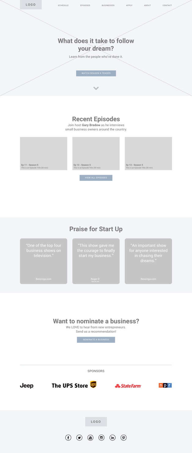
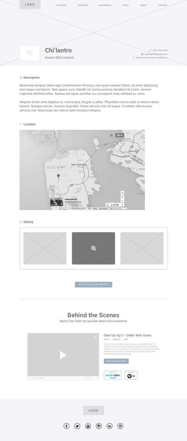
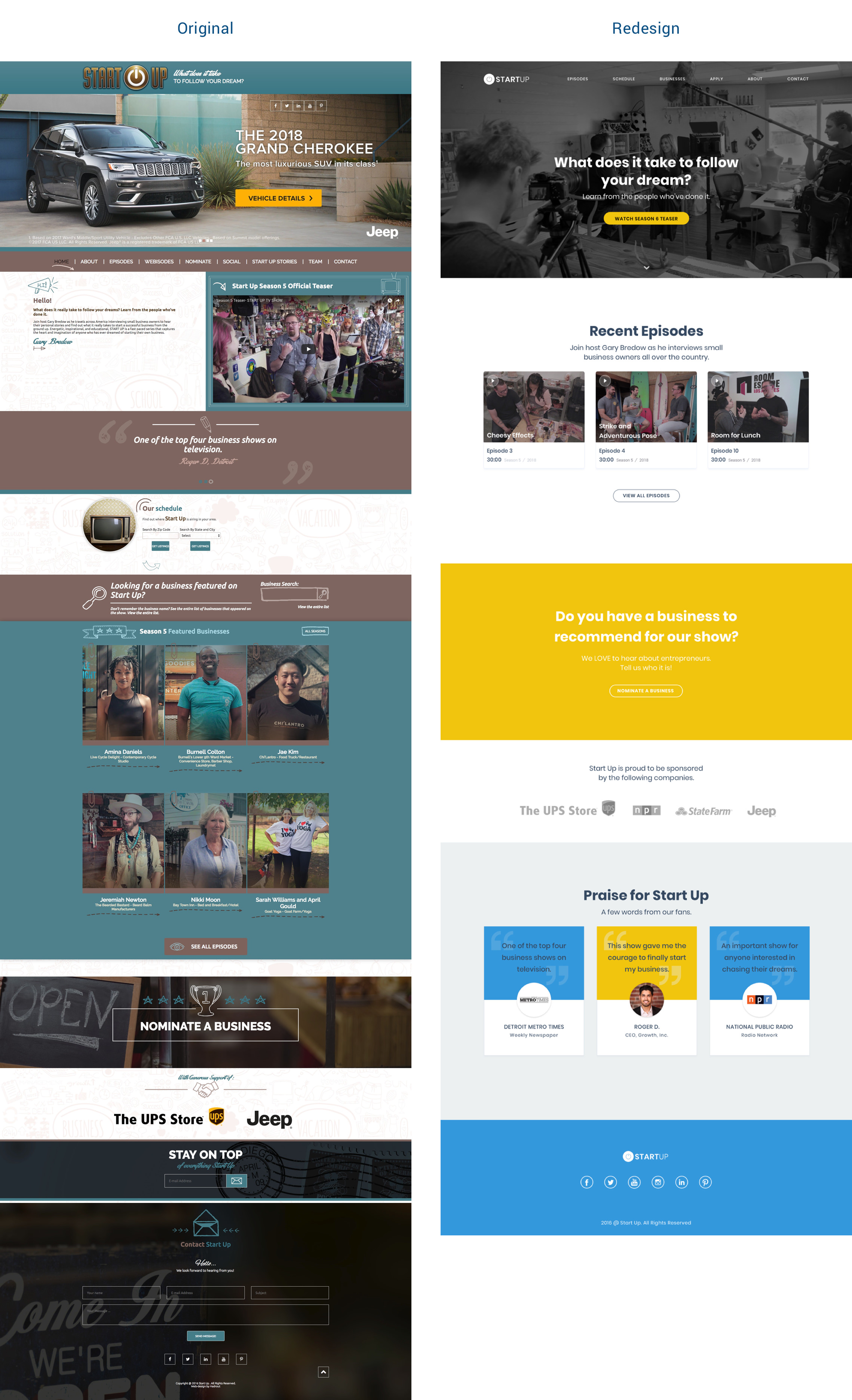
Homepage
For the homepage, I took the emphasis away from advertising and shifted the focus back to the theme of the show. Then I redesigned the navigation bar and repositioned other elements on the page to present a cleaner interface that would be easier to read and navigate.
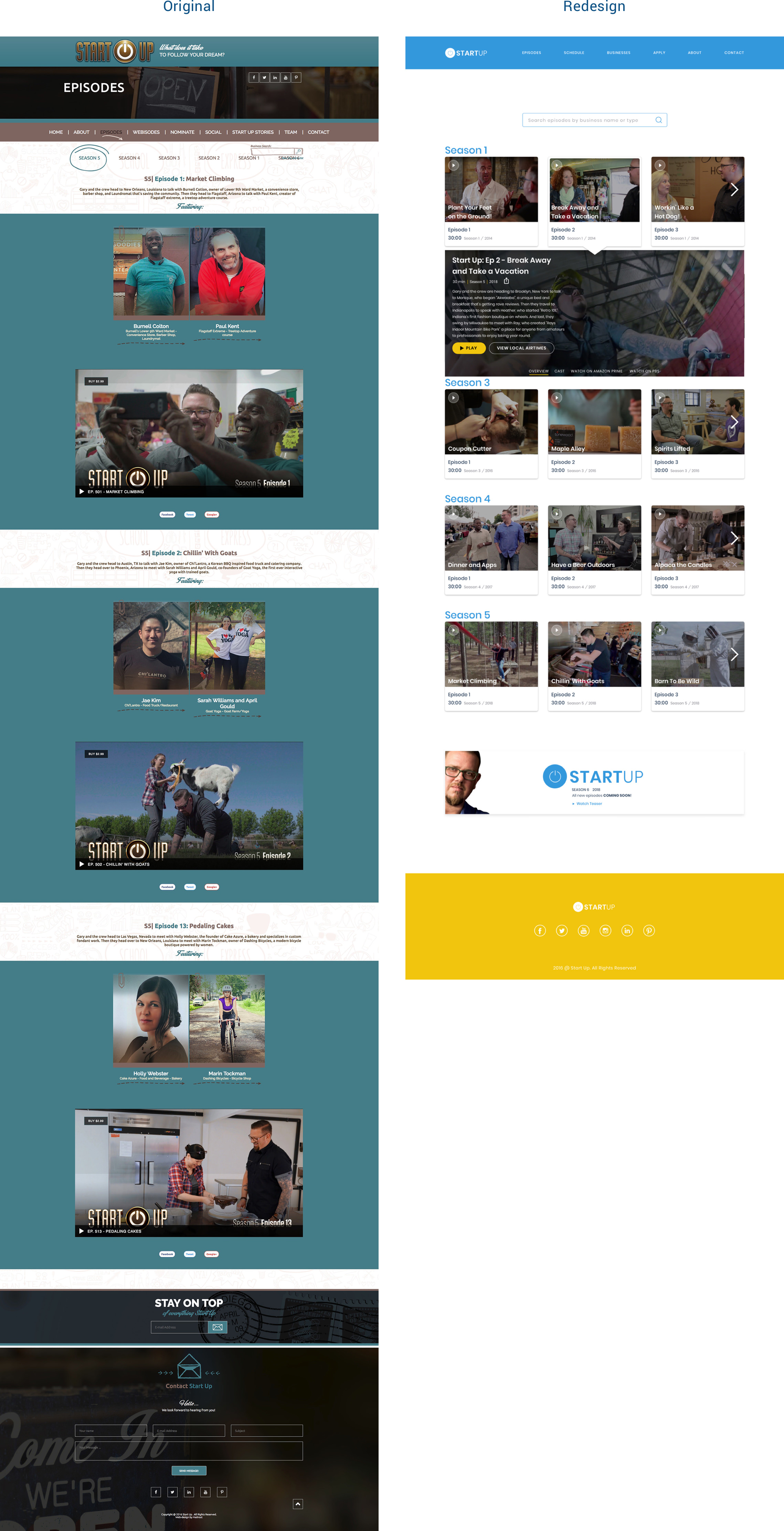
Episode Gallery
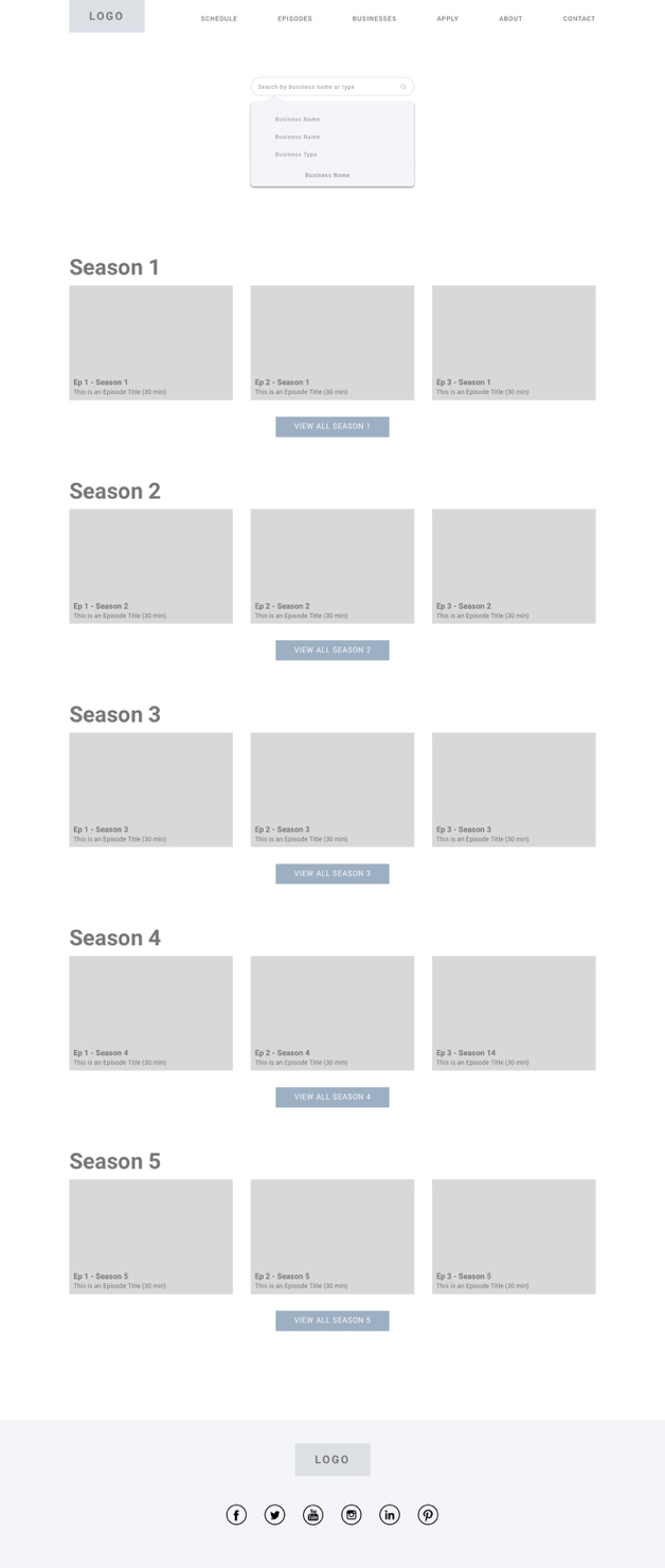
I redesigned the episode gallery page to resemble a more conventional movie streaming site. Rows of thumbnails were implemented to conserve space and to help reduce needless scrolling and clicking. I introduced dropdown previews with contextual navigation elements for each episode card. I also made the search bar filterable to improve accessibility.
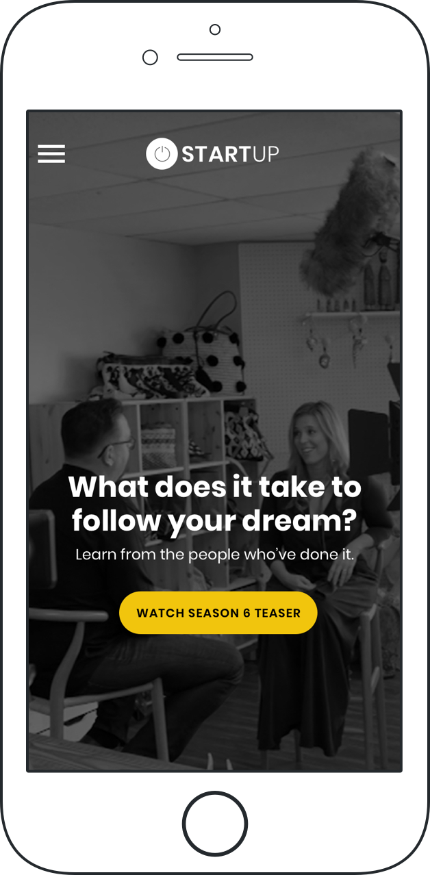
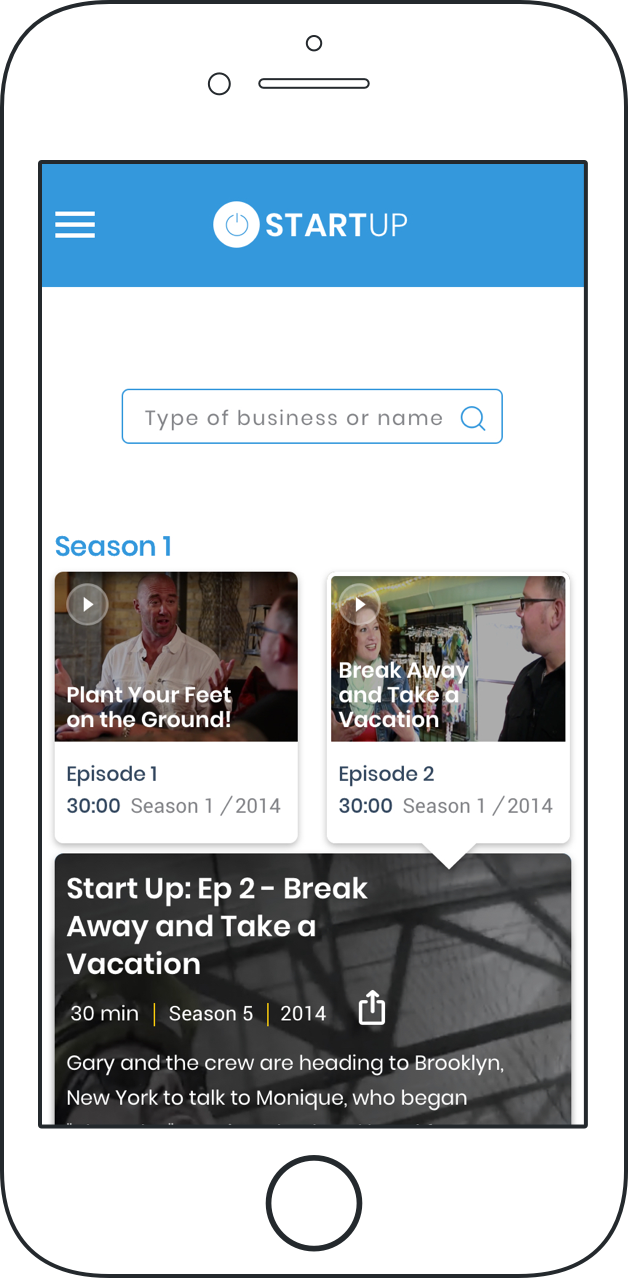
Mobile Screens
For the mobile screens, I carried over the same style and elements from the desktop design. I wanted to maintain consistency between devices.
Testing Phase
Next Steps
Another round of usability tests is necessary to measure the impact of the Start Up rebranding effort and the value it brings to the user. Further iterations will be implemented as needed.
Let's collaborate!
I would love to hear about a design problem you or your team are trying to solve. Feel free to drop me a line and tell me about it.
Ok, just a few quick questions.
After you introduce yourself and your project, I'll get in touch with you to schedule a time to chat. You should expect to hear from me in a day or so.