Spotify’s mission is clear—“to help people listen to whatever music they want, whenever they want, wherever they want—in a completely legal and accessible way.
As a streaming music service, Spotify is the group lead and it wants to stay that way. For this reason, they want to improve engagement and retention in the app. In order to do that, they want to expand on their social capabilities.
The Challenge
The challenge was pretty clear. To expand Spotify’s social capabilities seemed pretty straightforward. To accomplish this, there seemed to be no shortage of resources available at my disposal. However, before starting, I did take care to notice that there was a built-in assumption by the stakeholders that users would want or need more social outreach. How could I tell if this was indeed, the case? I would need to reach out to the user base to test this hypothesis.
The Goal
I needed to design one new feature and seamlessly integrate it into the existing app. I knew that in order for this to work, I would need to first test the assumption that the feature should provide a means to facilitate more social outreach. This would require extra work and care during the research phase. In order to determine what was important to the user base, I had to approach this project with a focus on discovery rather than trying to validate an assumption that may not be justified.
Research Phase
Interviews were conducted with a total of 17 participants. 5 of the 17 participants were interviewed over the phone. The remaining 12 participated in an online survey that was administered through SurveyMonkey. I was looking for greater insight into pain points, expectations, and desires.
Phone Interview Findings
- 4 out of 5 users did not use their app to share music
- All 5 users stated that app did not help them to connect with new people
- 4 out of 5 users saw value in a feature that would allow for discovering playlists that could be filtered by options such as star ratings and location
Online Survey Findings
- 58% of users preferred private listening. 25% didn’t care. 16% preferred public.
- 66% of users saw value in a feature that would allow for discovering playlists that could be filtered by options such as star ratings and location
- 33% of users did not want more social/sharing features added to their app. 25% were indifferent
Conclusions
After evaluating the results from both the phone interviews and online surveys, it appeared that the majority of participants gave answers which indicated either a distaste or indifference for the inclusion of more social media-like features.
Design Opportunities
- A preference that allows listening activity to default to a "private" setting rather than the "public" setting that is the current default
- More design granularity and options for favorites/playlists features
- Curated playlists from individuals that can be discovered via a filtered search menu and/or rating category
Define Phase
Persona
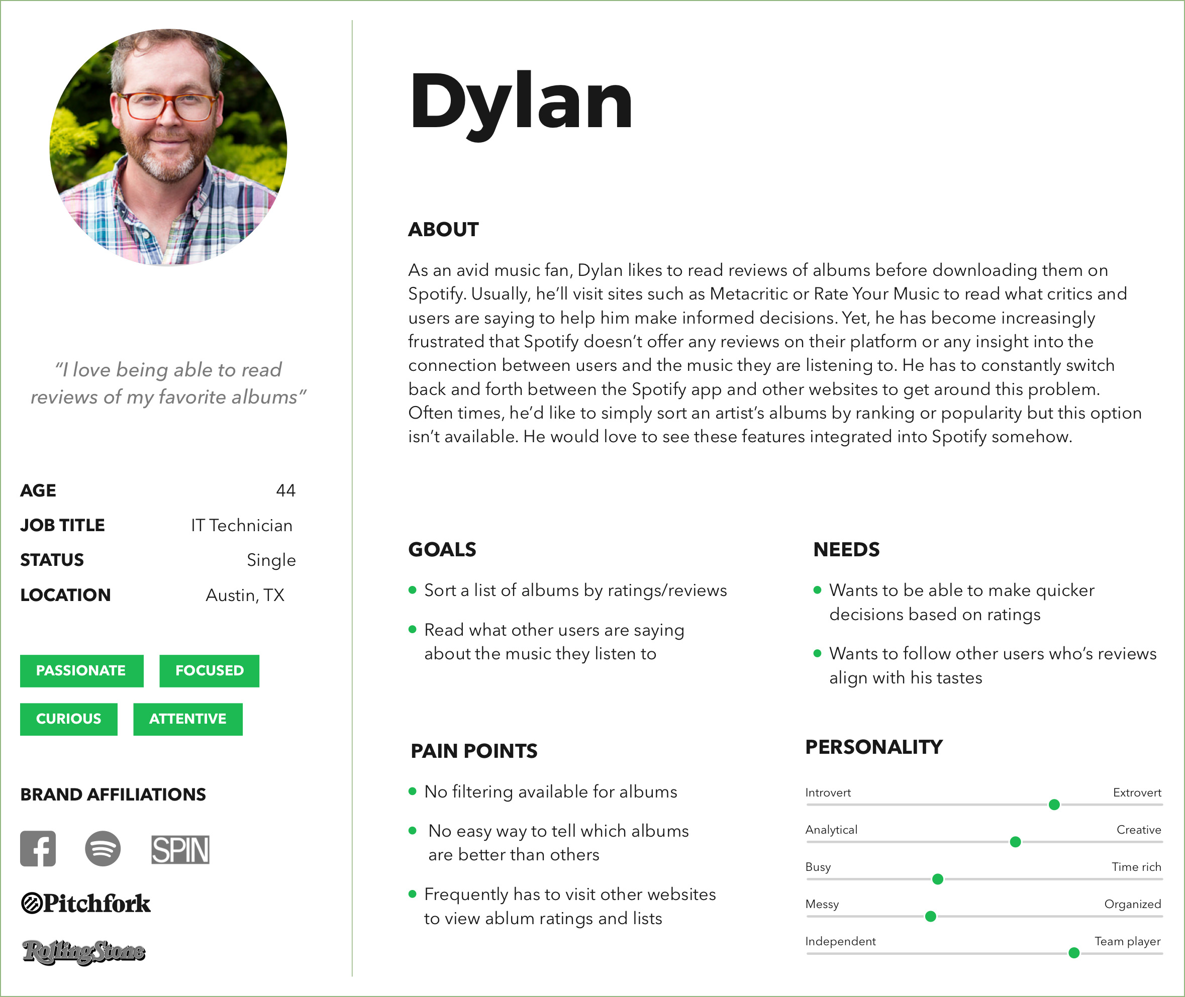
From my findings, I crafted a persona to help me gain a better understanding of which new feature I would be designing. Dylan represents a specific type of music fan. He is a person who places a lot of value in drilling down to the specifics of the music he listens to. He is not a passive listener and derives a lot of enjoyment in being able to tailor his musical tastes for any particular occasion.
Storyboard
From Dylan’s persona, I crafted a storyboard to help contextualize his needs and how they relate to using Spotify app for a very specific scenario.

Journey Map
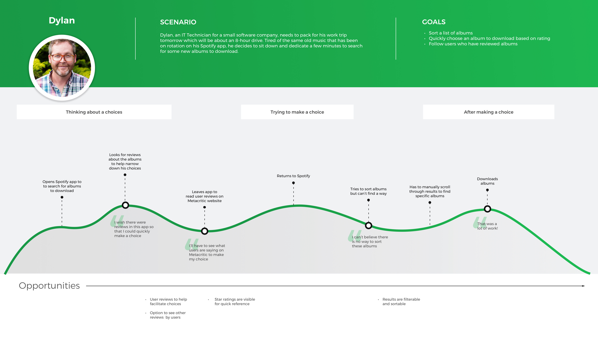
To better understand the contextual problem that Dylan was facing, I decided to create a journey map which would illustrate the pain points he encounters at a more granular level.
Feature Roadmap
I considered Dylan’s needs, how they related to the findings from my research, and what kind of features would work best to address those problems. Then I prioritized those features.

Task Flow
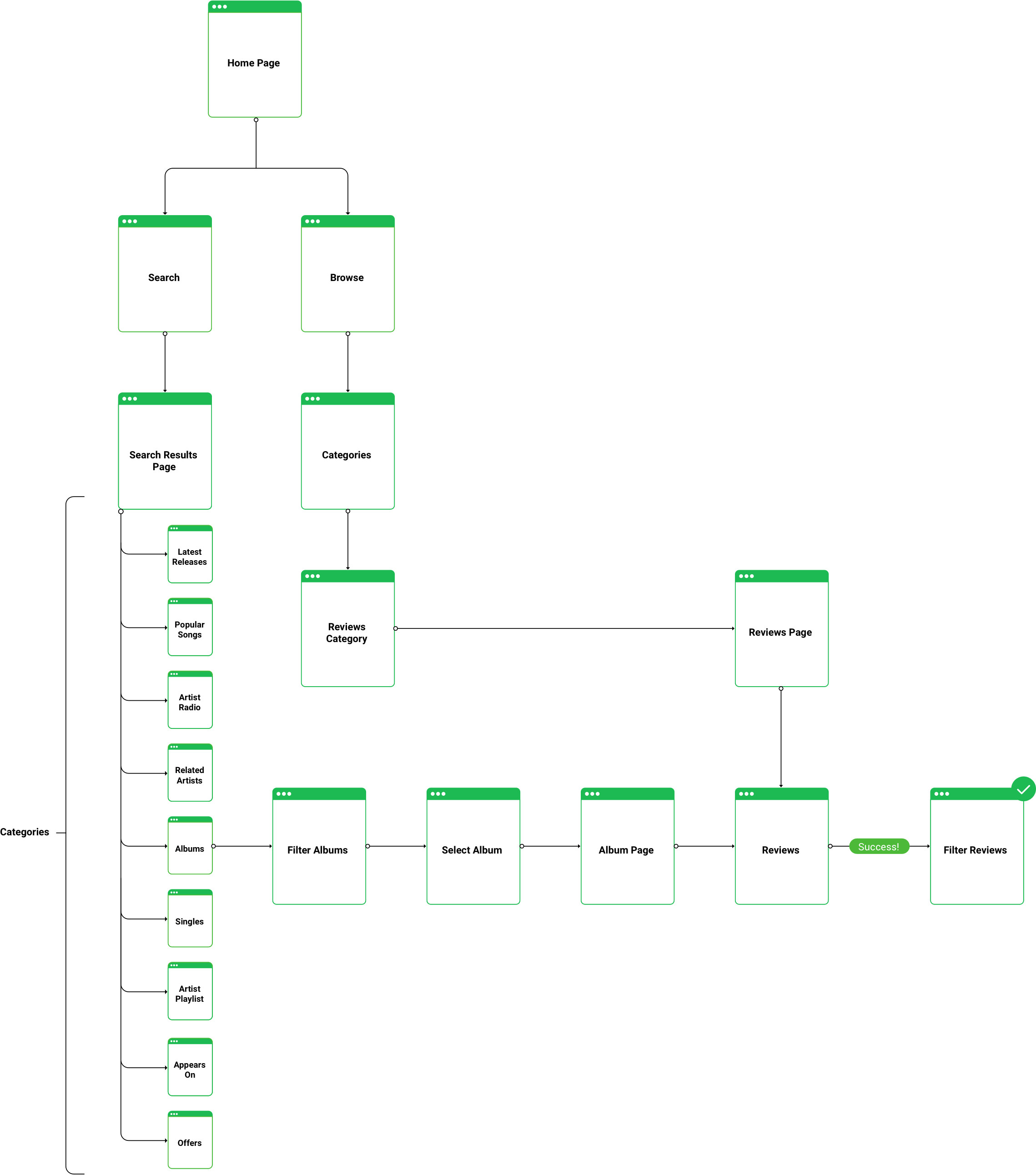
In order to seamlessly, integrate a “Reviews” feature into the existing Spotify app, I would need to consider different routes that could be taken to arrive at the same point. To achieve this, I mapped out a task flow that illustrated how a user could navigate to the “Reviews” page via Search or Browse in the navigation bar.
Design Phase
Sketches
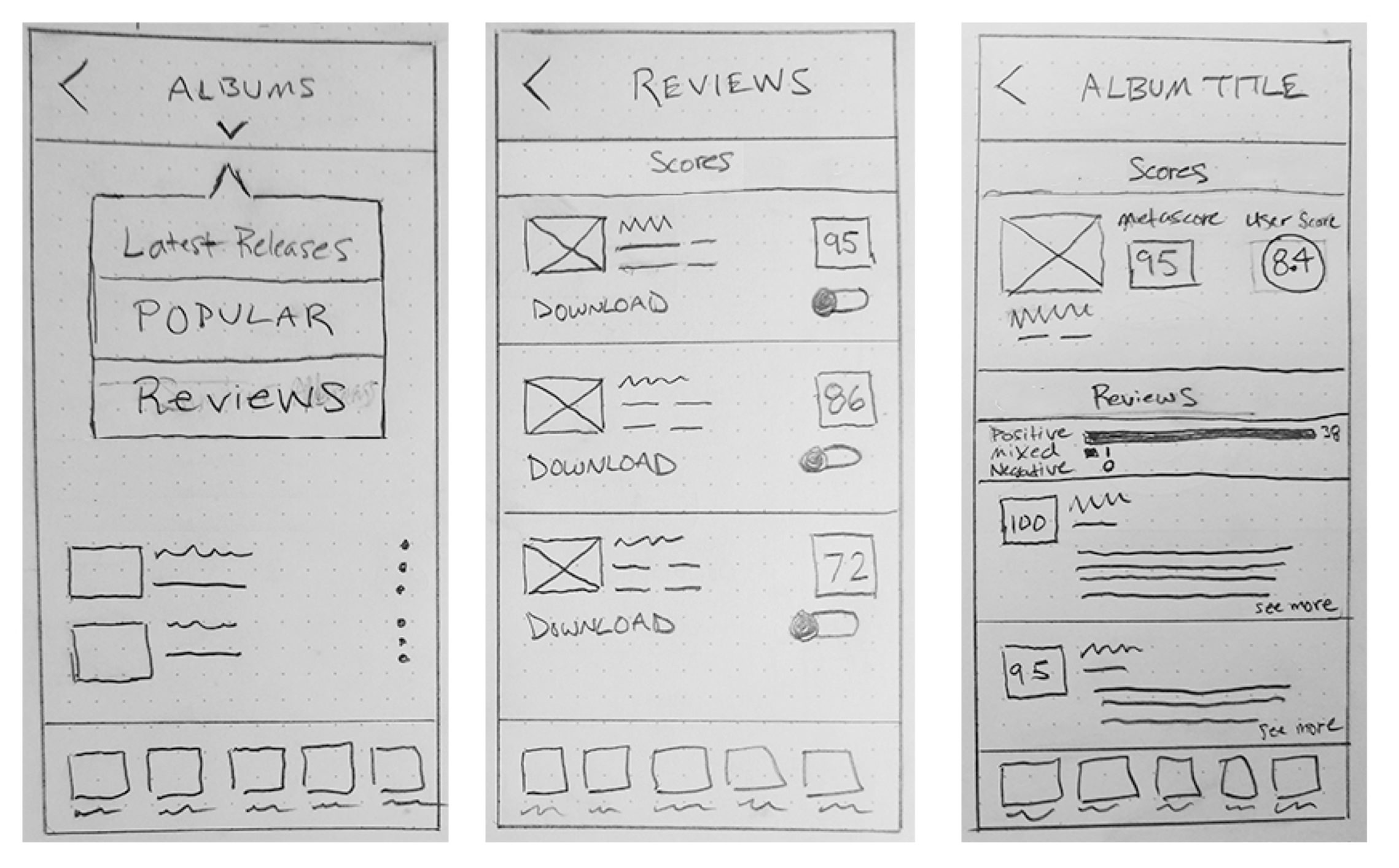
Since this was a new feature, I did some preliminary sketches to explore different ways to integrate it within the existing framework. This helped set the stage for wireframing.
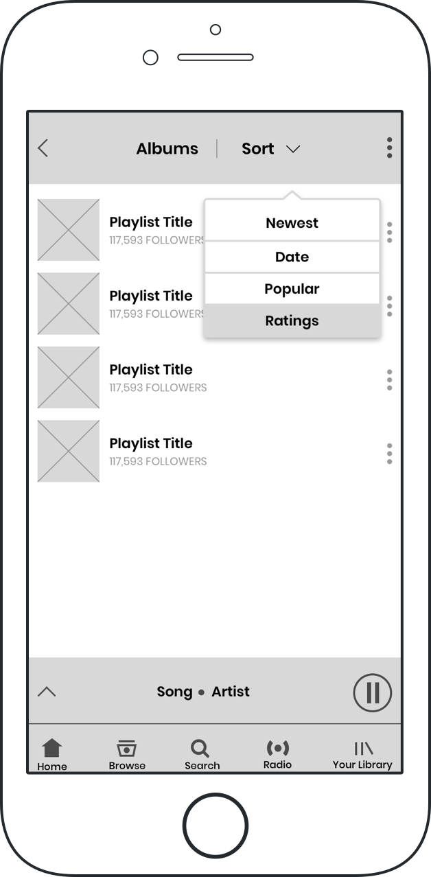
Wireframes
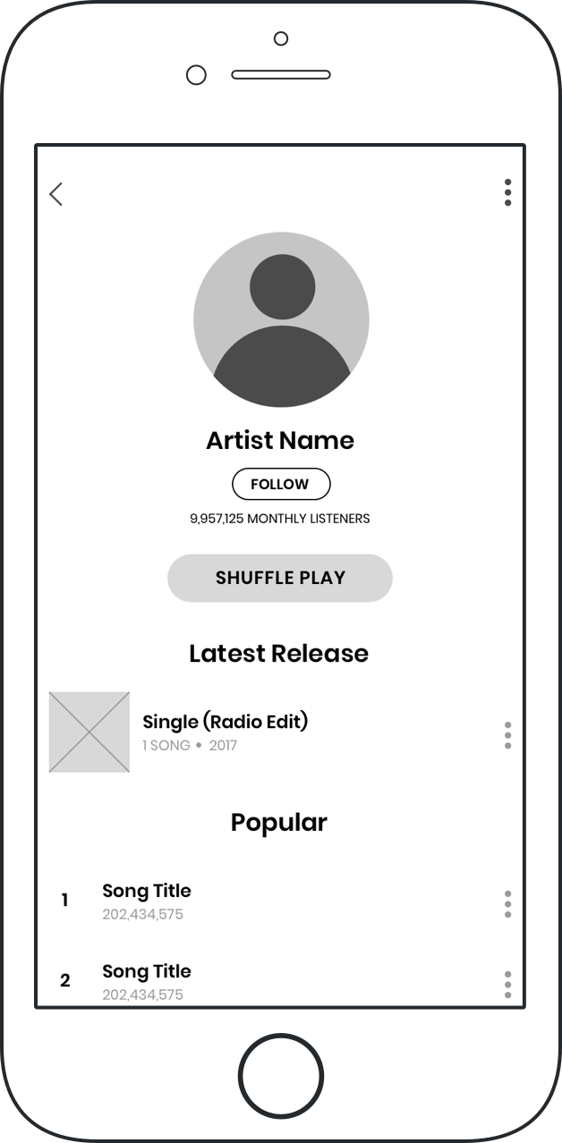
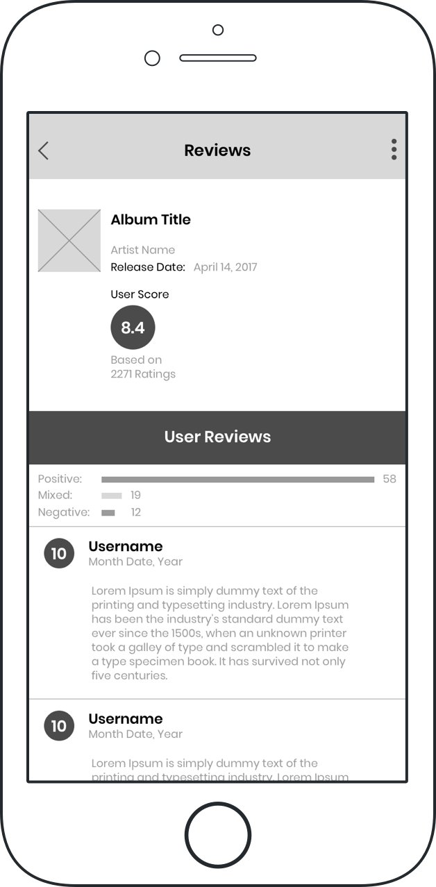
When creating the wireframes, I would often reference the current layout and branding as it appeared in the existing app. I was striving for seamless ingegration and something that would feel consistent with the rest of the branding.
Usability Testing
I assembled the wireframes into a prototype using InVision and tested 7 participants via remote testing. Through it all, I made sure to take notes and record the sessions so that I would have an accurate record of what transpired.
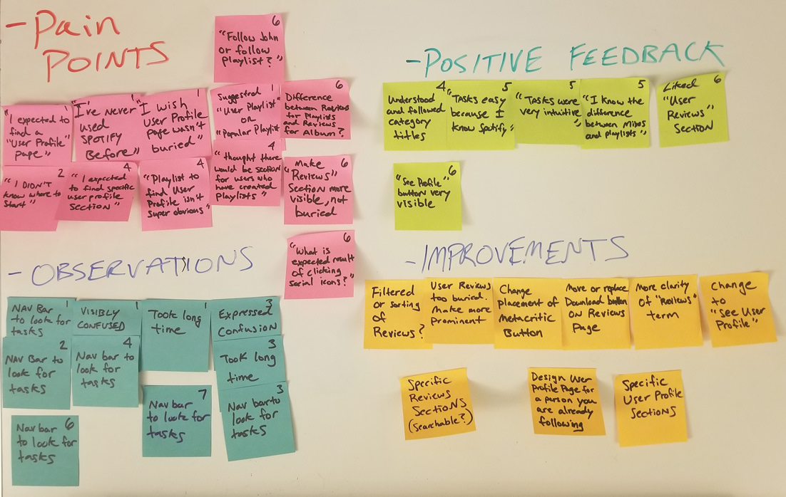
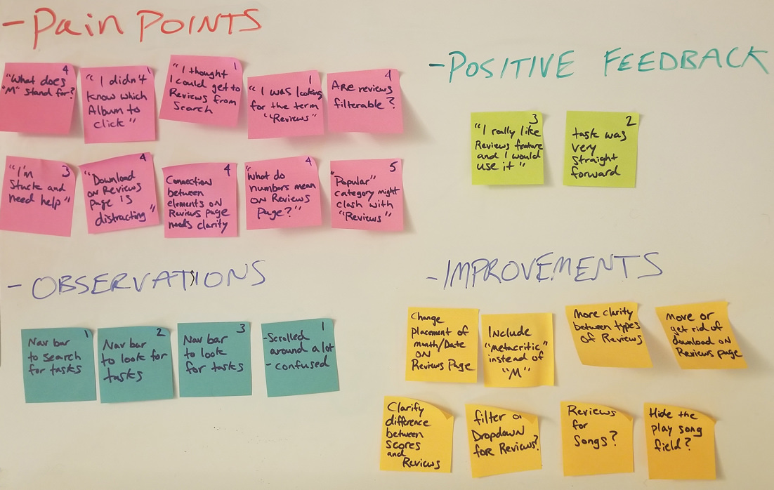
Affinity Mapping
I reviewed my usability test notes and created a map to identify patterns.
Key Findings
On average, I found that most participants were able to find the “Reviews” section with very little difficulty. The area needing the most improvement was the “Reviews” feature itself.
- Most participants were able to find the “Reviews” section with very little difficulty
- Some participants were curious whether or not they could filter or sort reviews
Design Improvements
- Abandon concept of third-party review publications to facilitate better customer retention
- Limit Reviews feature to within the app itself
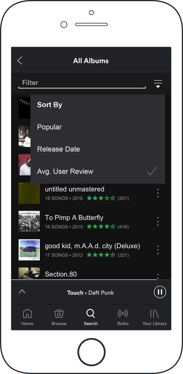
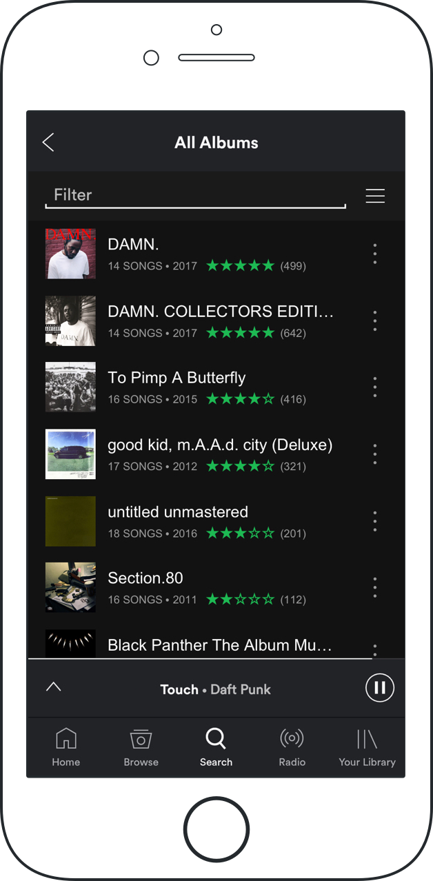
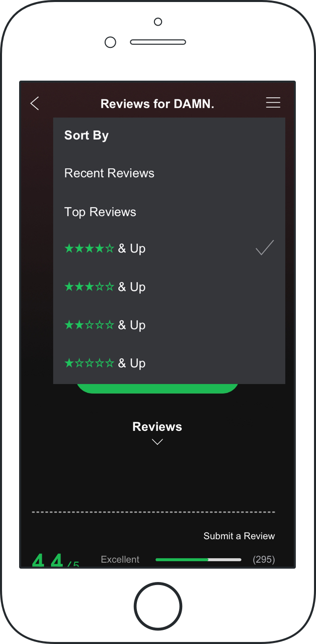
- Introduce sorting and filtering to Reviews feature
High Fidelity Screens
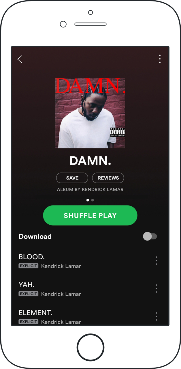
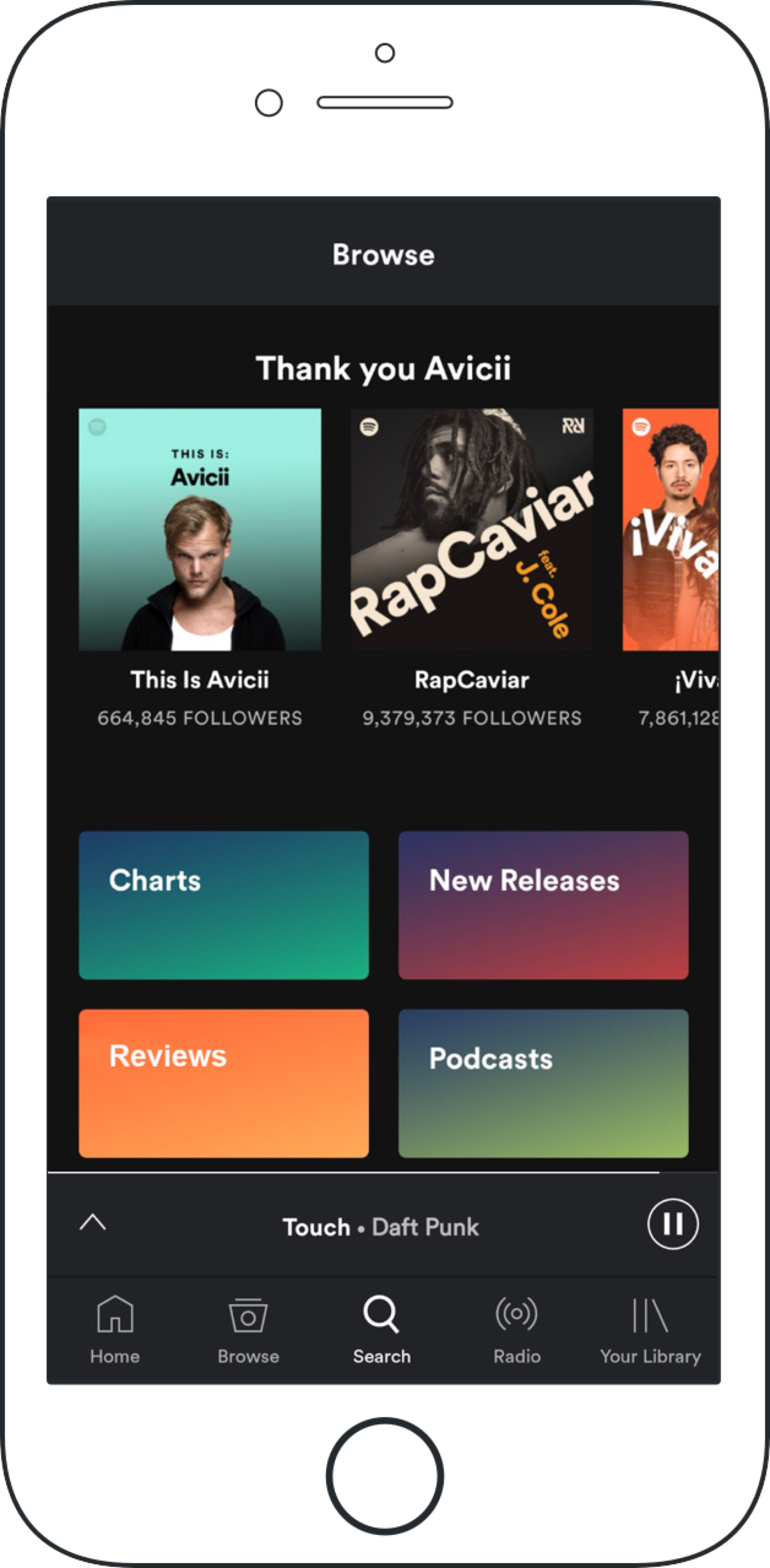
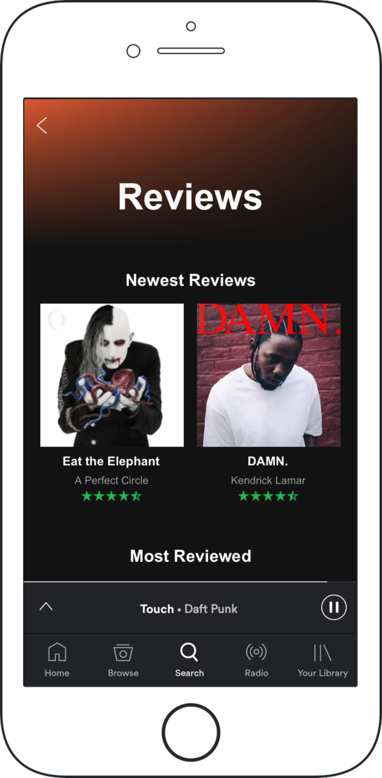
From my research findings, I created high fidelity screens which included "filtered" search functionality for looking up and sorting reviews. I also included a specific "Reviews" category that would be easily accessible from the "Browse" section.
Testing Phase
Next Steps
More usability testing is necessary to measure efficacy of “Reviews” feature and its value to the user.
