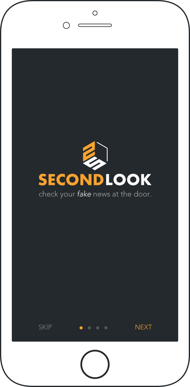
Check your fake news at the door
Mobile UX/UI Design • Concept Work
Can you think of a problem that can't be addressed by a mobile app? Granted, problems like cancer and tooth decay can’t be fixed with an app but the vast majority of dilemmas we face today have a digital solution or one that is in the works. The ubiquity of mobile apps in the modern world is dramatically changing the way we address and solve our problems.
One of the most widespread problems we face today is misinformation. This is especially true in today’s politically, charged climate. But is there an app for this?
Other than visiting websites such as Snopes.com or Politifact.com, where do you turn to ensure that the news you hear is credible? And more importantly, how do you engage with others on current events in a constructive and meaningful way? Where is there transparency in the news? How would you dispute a dubious source without subjecting yourself to trolling? Are you able to share your opinions with others and have a meaningful exchange? Would you like to see what the counterarguments are and the sources behind them? Do you trust what your friends or relatives tell you? How about news that you hear on the radio or watch on TV?
The Challenge
In thinking about the problem of fake news, it became clear that there wasn’t a convenient platform to address the problem of misinformation. Sure, there were the aforementioned websites and there are news aggregator apps such as Flipboard and Google Play Newstand. These apps offer the convenience of being able to read stories from multiple sources but none of them offer any valuable insight into the credibility of those sources or how many readers agreed versus those who didn’t.
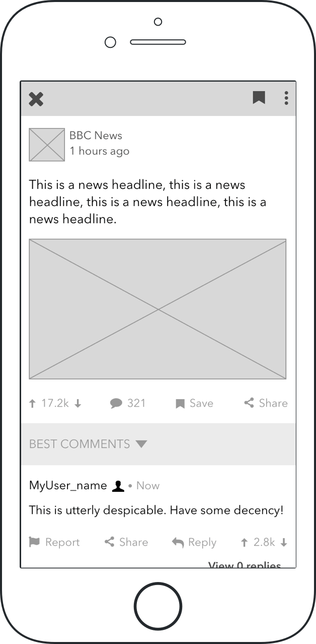
Furthermore, none of those apps offered a meaningful way to interact with other users outside of a typical comments section. More often than not, these comment threads amounted to little more than an echo chamber for sycophants or a party of trolls.
For those who feel like they have a stake in world events, accurate reporting, transparency, and open lines of communication matter. While my objective wasn’t to eliminate the problem of fake news altogether, I wanted to offer a way for people to glean more transparency from the news and interact with each other in a meaningful and constructive way.
The Goal
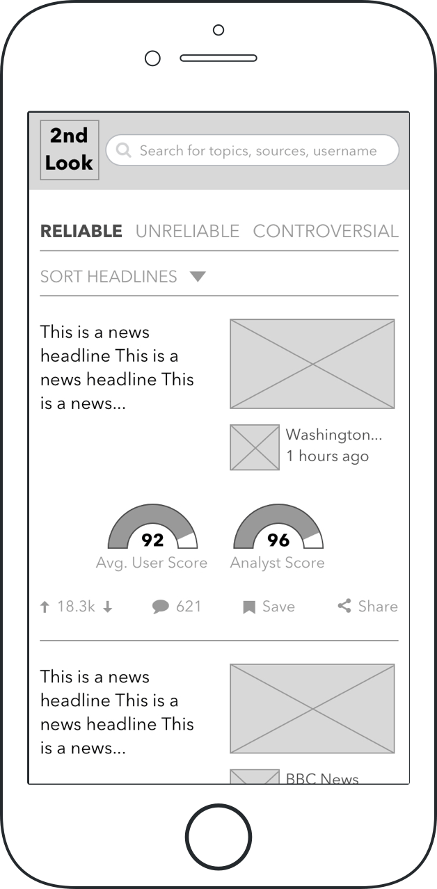
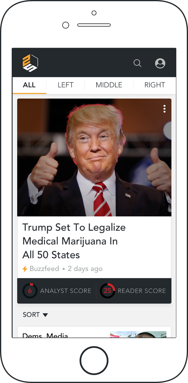
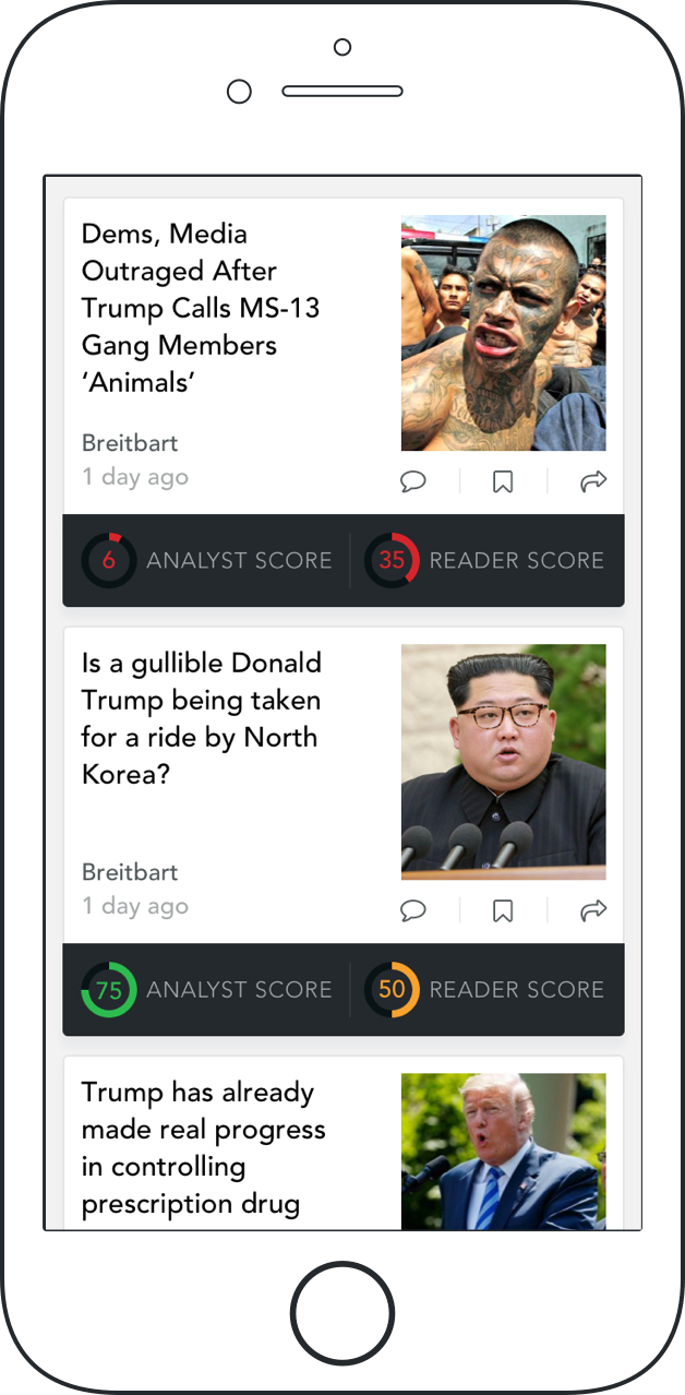
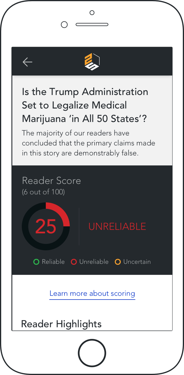
I set out to design an end-to-end app that offered a system of checks and balances on two fronts - an analyst score and a reader score. Similar to Snopes.com, these scores would be included for all news stories. The scores themselves would be an average, determined by users and analysts, indicating the level of accuracy and credibility for each story.
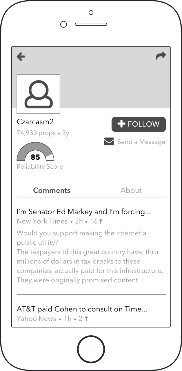
The “reader score” would be determined by input from the user base who would be vetted by moderators to help mitigate potential problems such as artificially boosting scores or trolling. The idea was to offer perspective on both fronts so that readers could compare and contrast disparities and view linked source material to help make informed decisions and take part in a conversation themselves.
Since this was a design from scratch, I made sure to map out a project timeline to account for time spent on research, information architecture, and branding.
Research Phase
Interviews and Online Surveys
Before recruiting my interview participants I brought some assumptions to the table. I determined who my target audience was and then considered what was important to them. Since I was targeting individuals who cared about the news, I assumed that convenient access to accurate information would be a high priority.
I facilitated phone interviews and conducted three online surveys through Survey Monkey, Reddit, and Survey Tandem. There were a total of 11 participants.
Affinity Mapping
I mapped out the answers from my interviews and online survey into an affinity map to identify patterns and potential problem areas.
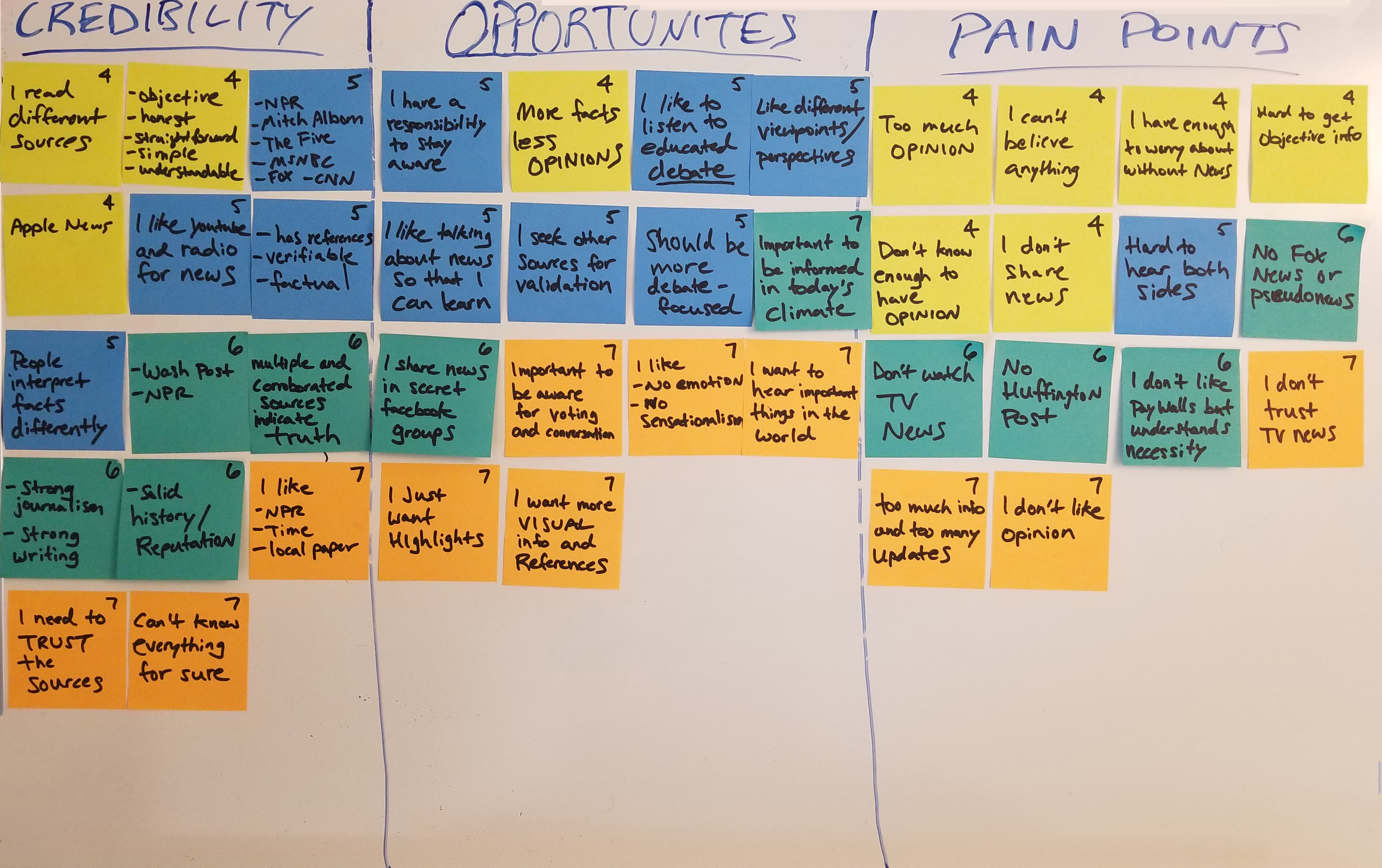
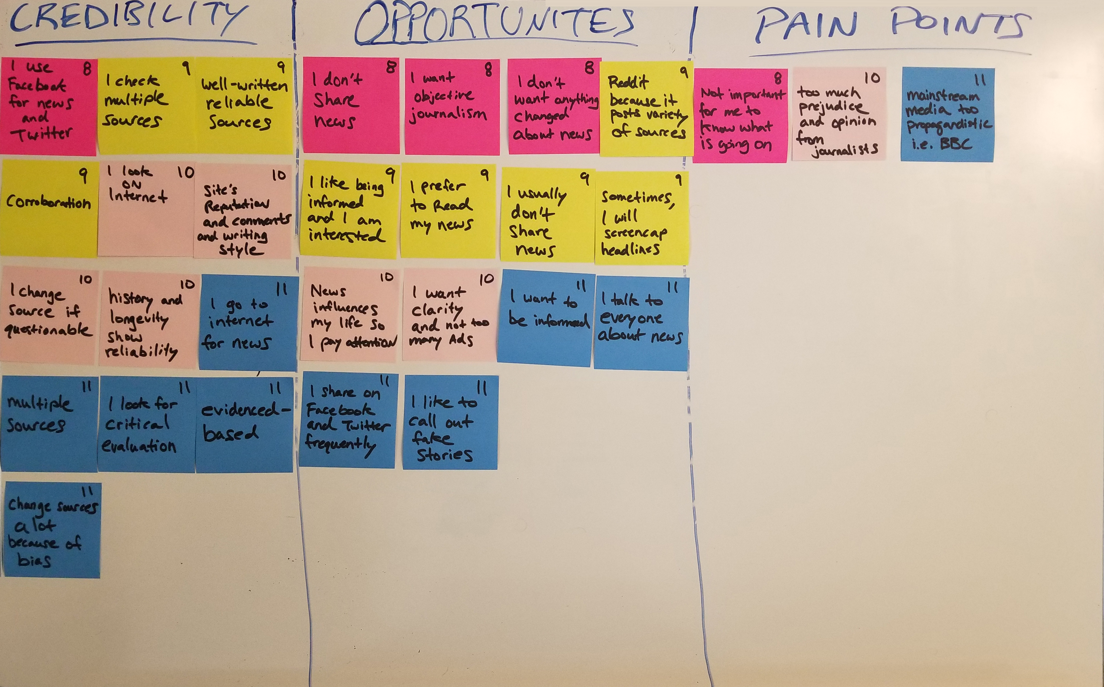
Key Findings
There didn’t seem to be a whole lot of variance in the answers I received. Most of my assumptions regarding the value of corroborated sources and objectivity in the news appeared to be validated in the feedback. This seemed to be the case irrespective of one’s political affiliation and gave credence to the value of obtaining news coverage from a wide variety of sources.
- Access to multiple sources was important to all participants
- Zero participants preferred to get their news from TV
- Most participants valued objectivity over opinion when reporting the news
- Most participants saw value in reading commentary from other users to gain perspective
Competitive Analysis
I thought it would be instructive to compare and contrast the features across different news aggregator apps so that I could establish a good jumping off point for my design. In order to do this, I downloaded 6 different apps on my phone and explored how they worked in order to get a feel for how they functioned on their own and in comparison to one another.
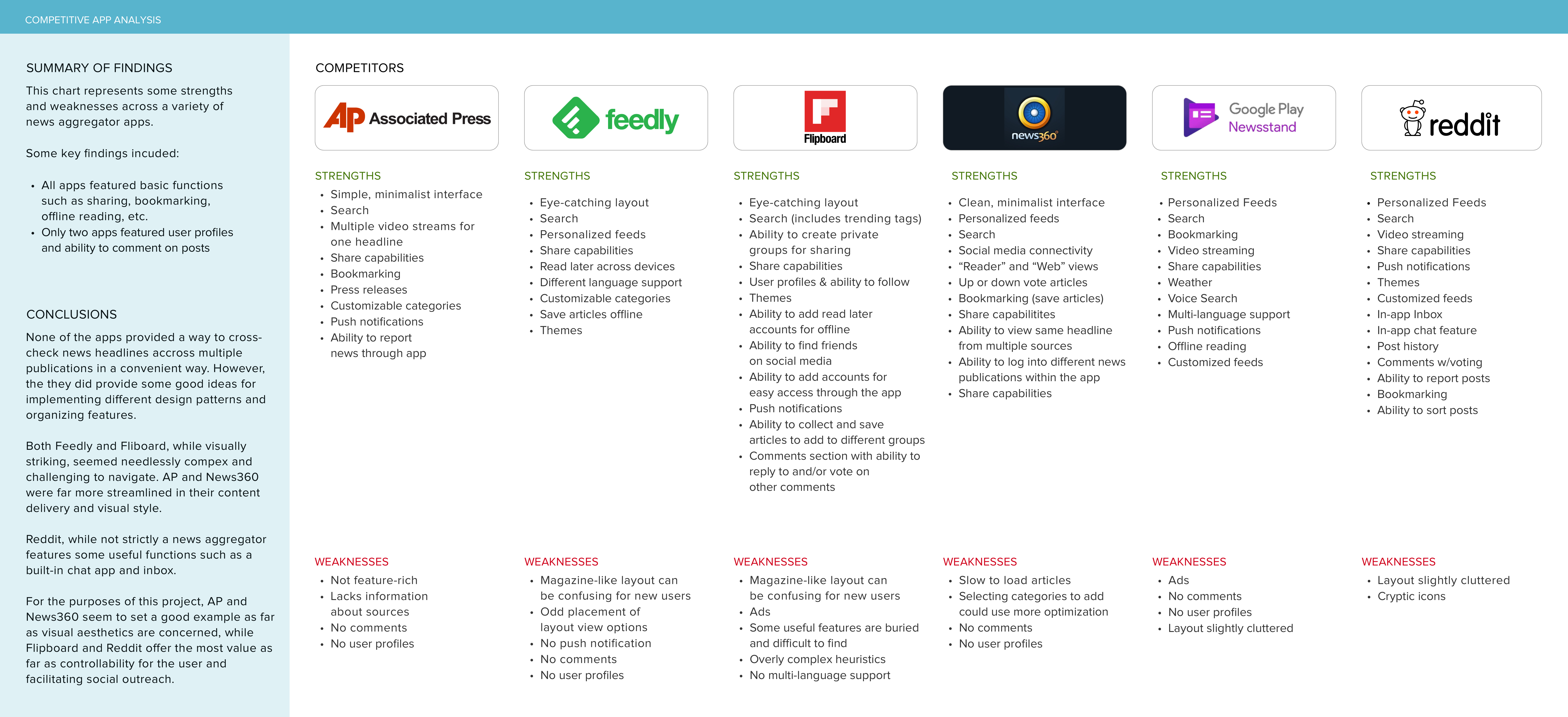
None of the downloaded apps provided the specific service that I was offering but they shared enough in common that they served as a good reference point in drawing inspiration for my design strategy.
Define Phase
Personas
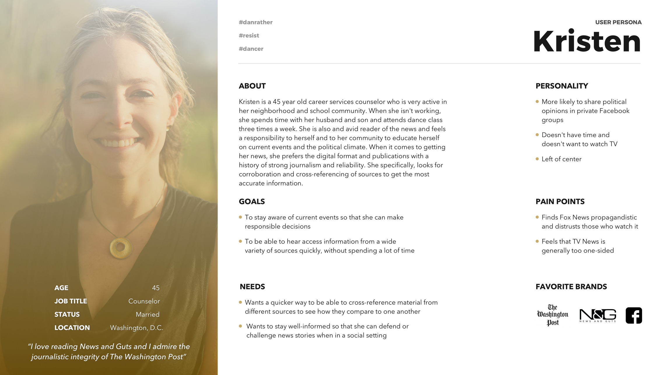
I created two distinct personas since I thought it was important to demonstrate how the app could prove useful to people who had different political affiliations, yet shared common interests and goals.
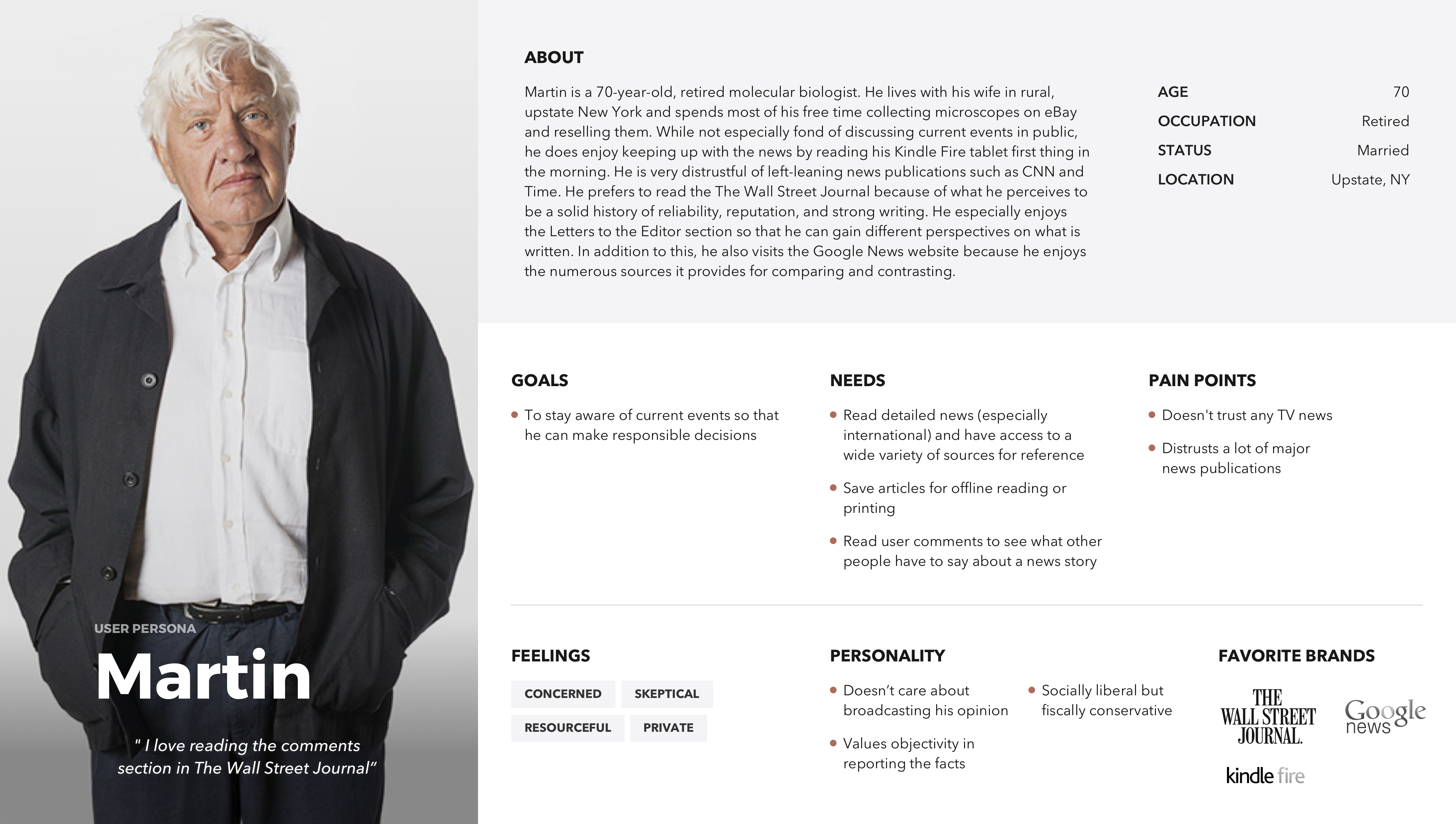
Empathy Mapping
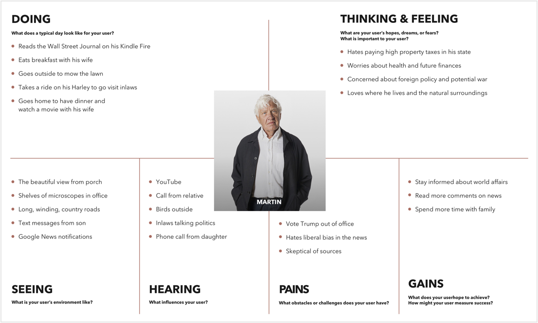
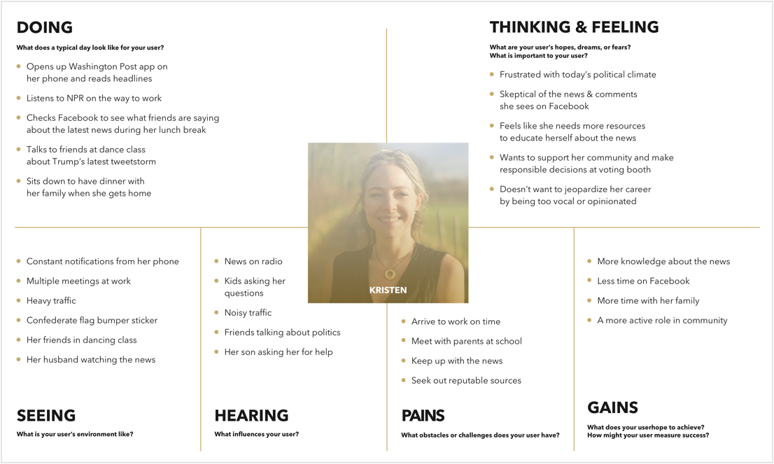
To further develop the personalities of Kristen and Martin and to gain a deeper understanding of their needs, I created a couple of empathy maps. I considered their daily activities and feelings, along with contextual examples of each.
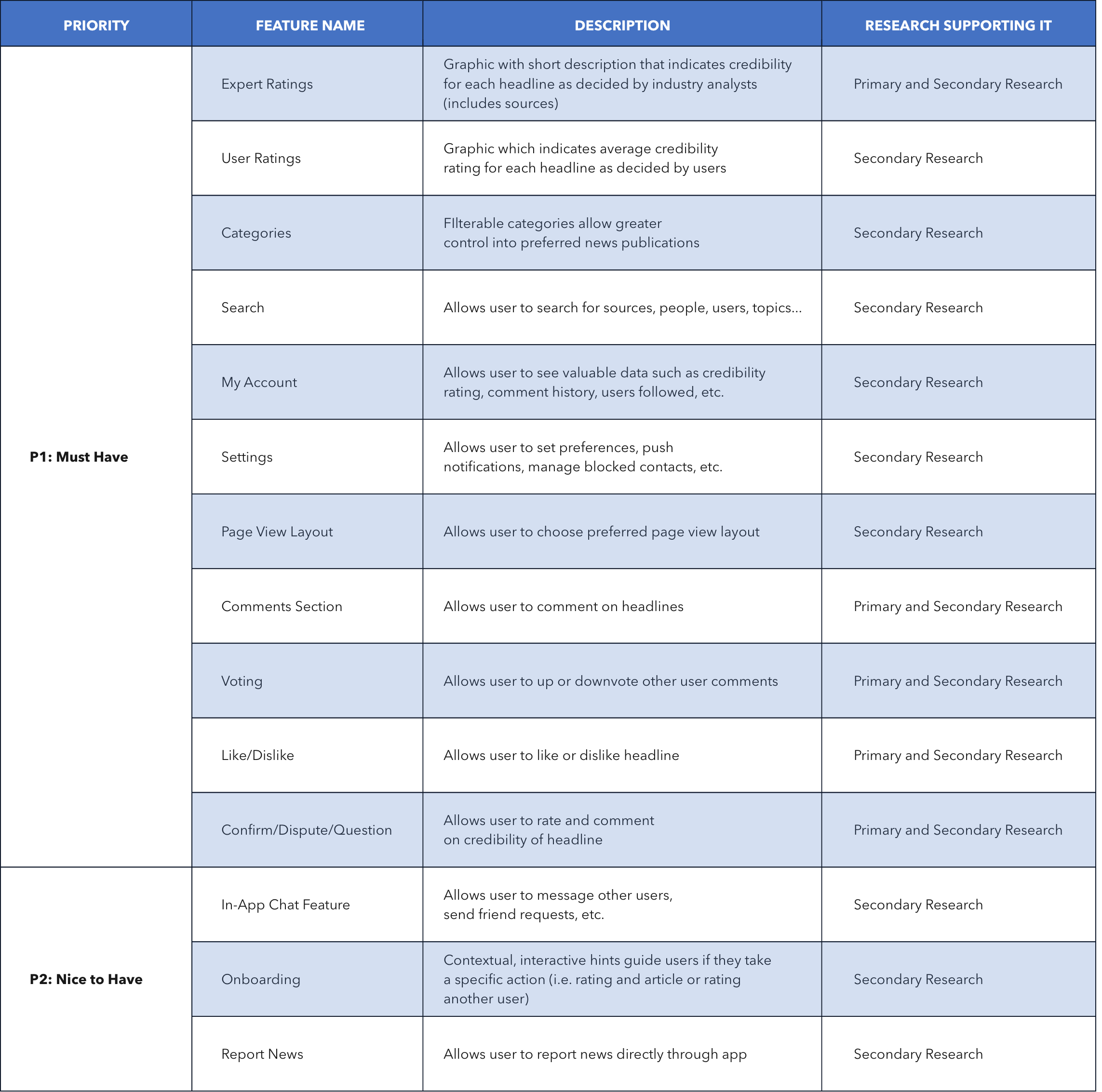
Feature Roadmap
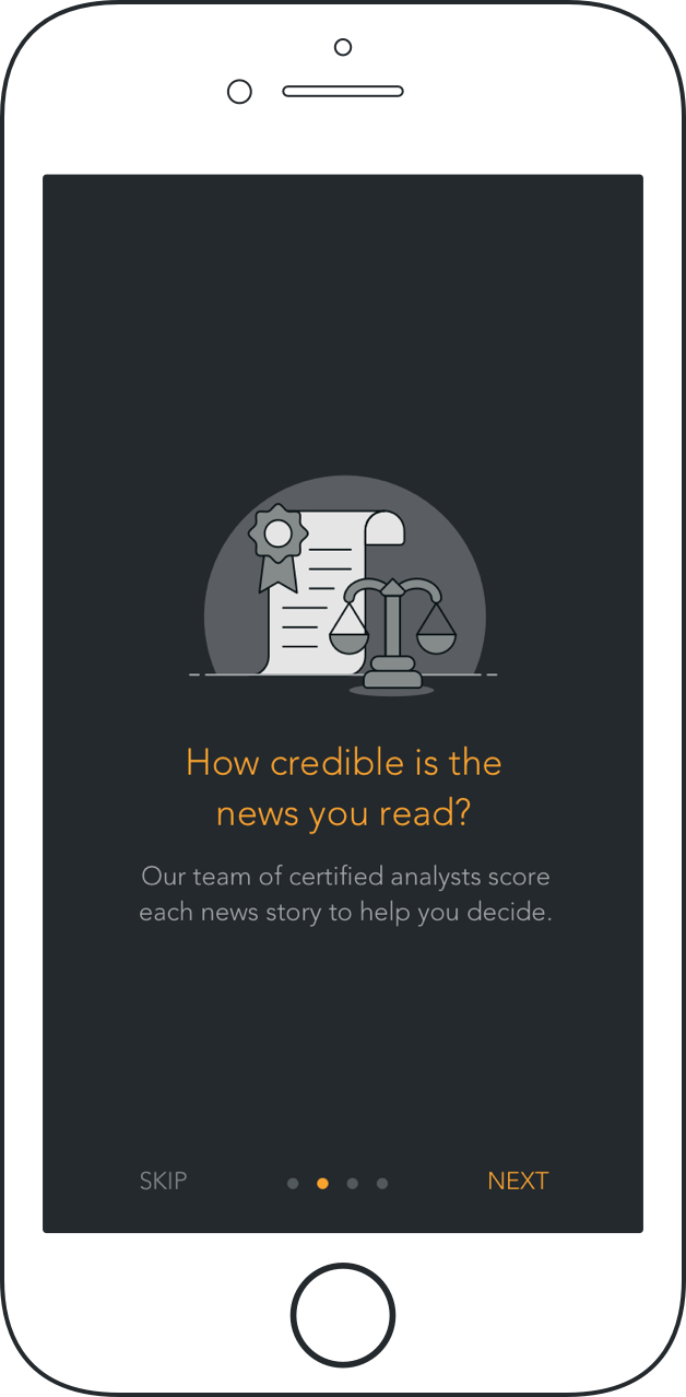
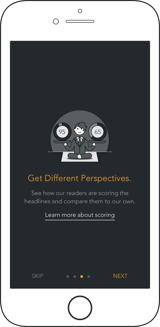
Since the value proposition for Second Look was mostly user-centric, I tried to prioritize features which would be most beneficial from that perspective. One key feature I was considering was an onboarding flow. The concept for Second Look was new and unfamiliar, and a brief introduction that explained how the app worked would be beneficial for new users.
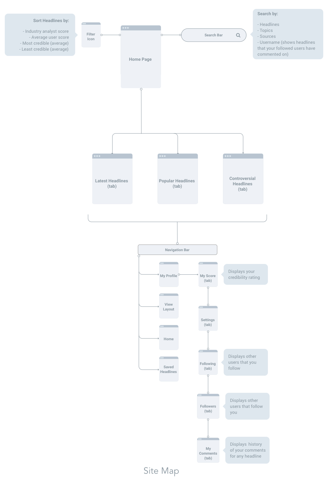
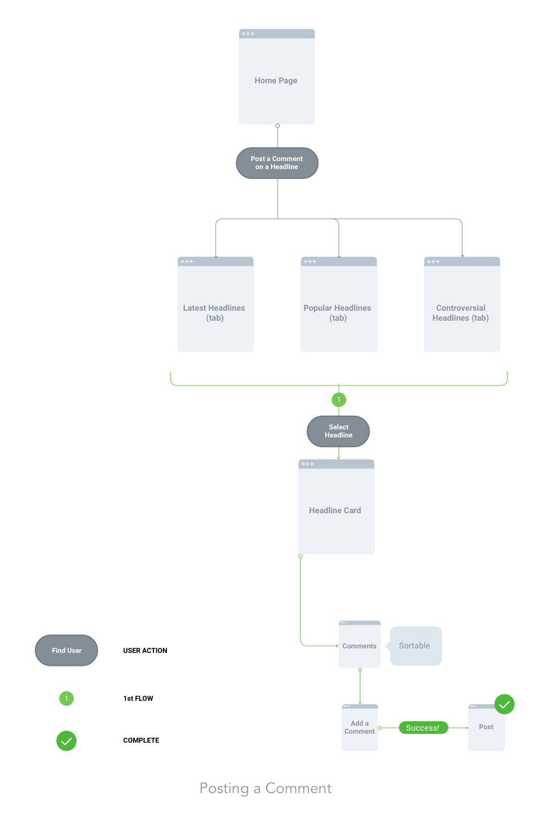
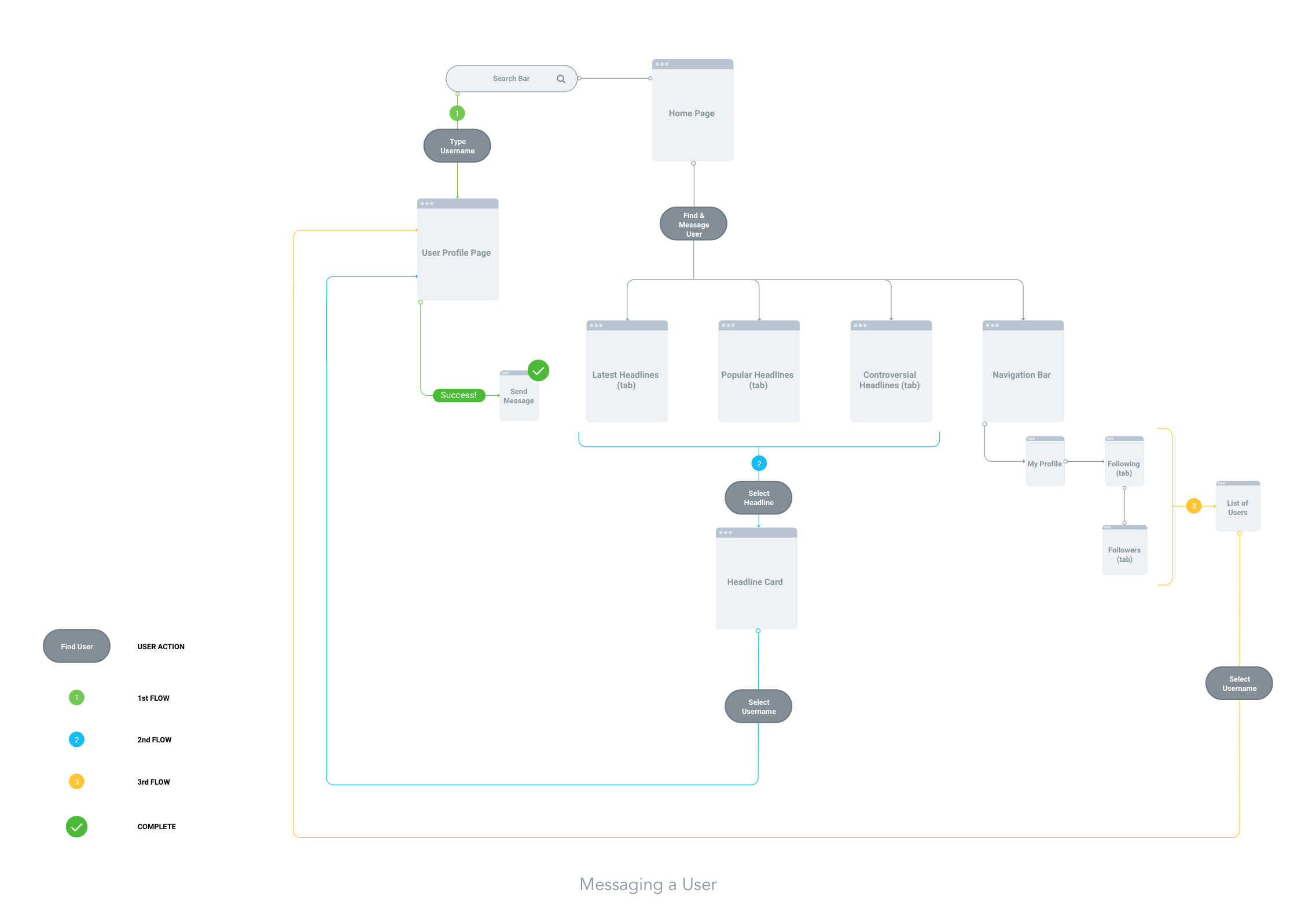
Site Map and Task Flows
To establish the architecture of Second Look, I created a high-level sitemap. I continually referenced my feature roadmap to make sure that all of the critical features were accounted for. Additionally, I referenced other news apps to help determine where things should be grouped together and organized. The task flows focused on "Finding and Messaging a User" and "Posting a Comment on an article".
Design Phase
Sketches
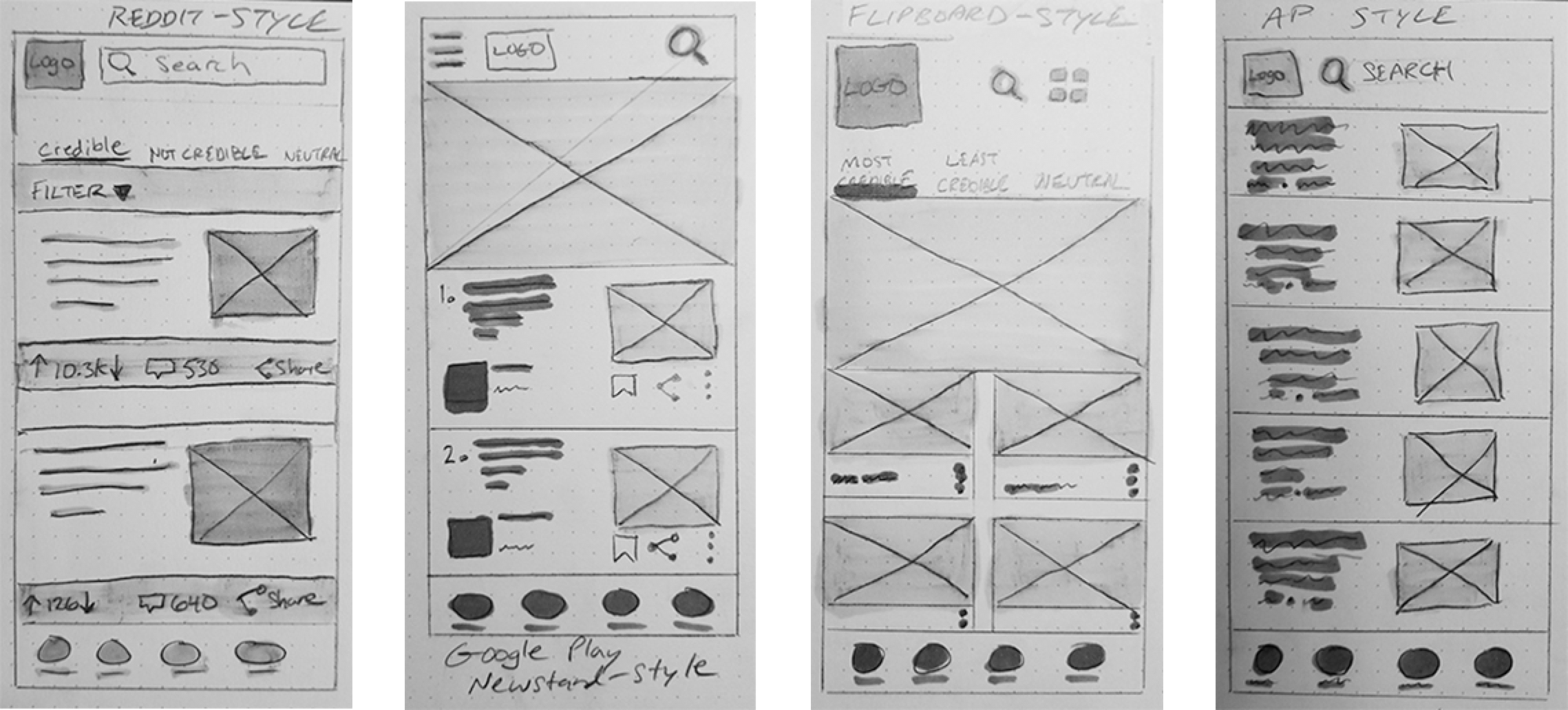
I sketched some different card style layouts for the homepage to explore which one might offer the best visual presentation and functionality for my targeted audience.
Wireframes
After deciding on the layout, I proceeded to create the wireframes for the firtst prototype. The overall design was an inspired combination of design patterns from Google Play Newstand, Fliboard, and Reddit. Reddit was unique in how it offered user-centric features that were similar to the ones I was developing for Second Look.
Usability Testing Tools
After compiling my wireframes in Marvel, I recruited 6 participants to test the prototype. All participants ranged between the ages of 25 and 71 and fell into different demographics. I used a variety of tools at my disposal for this process.
- Marvel
- Loom screen recording web app
- Stopwatch
- Notepad
Additional Affinity Mapping
I reviewed my written notes and video recordings from the test results to create another affinity map. I was looking for patterns to identify pain points, wins, and opportunities for improvement. Minor outliers aside, most of the feedback was positive and further validated the assumptions I had during my preliminary research.
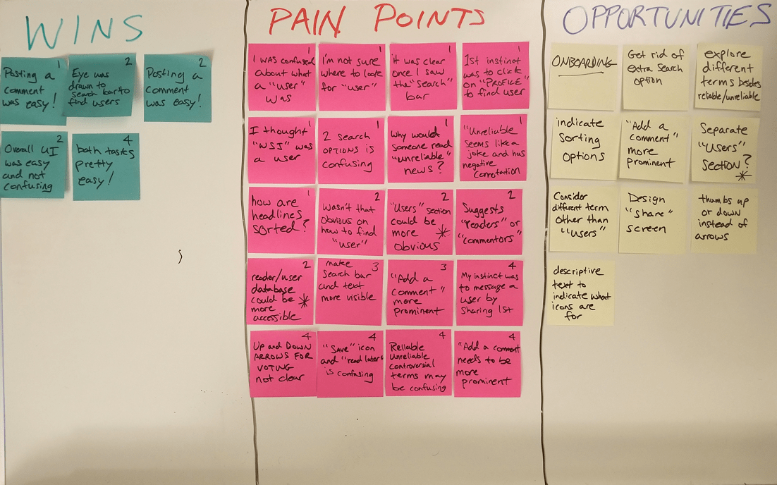
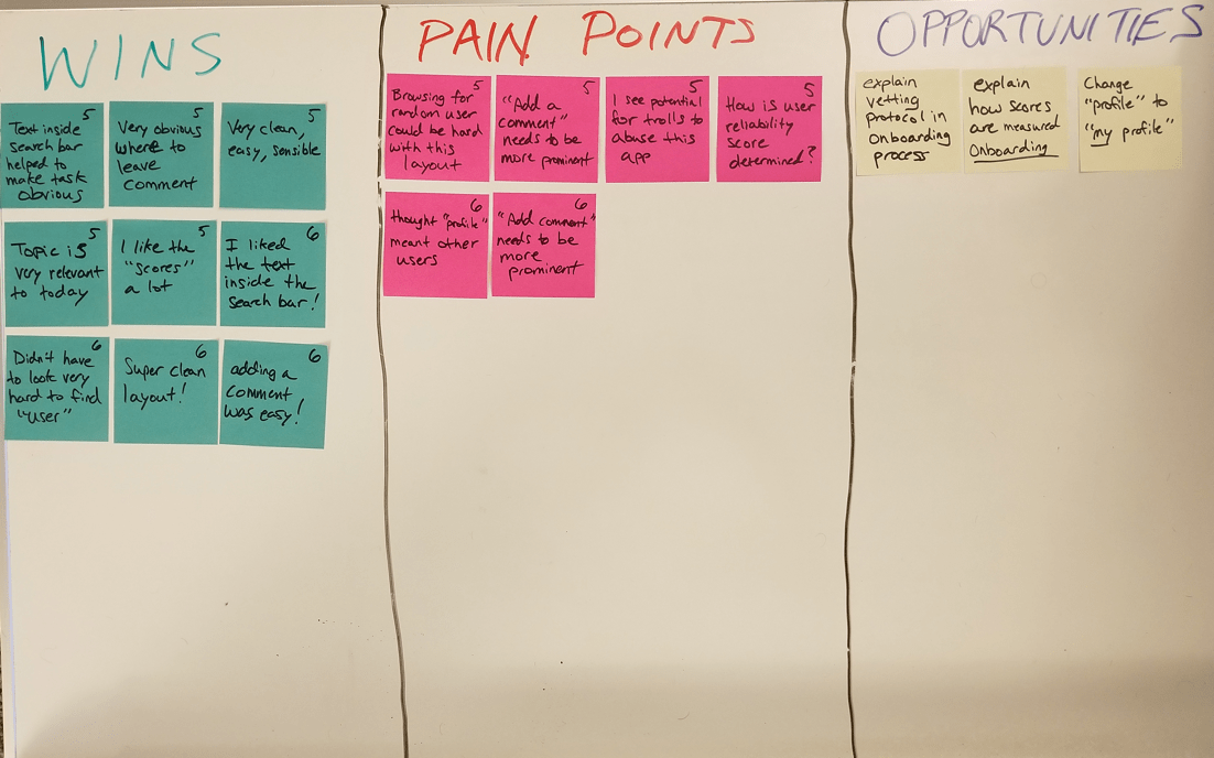
Key Findings
There were just a few obstacles to be addressed. These included confusion over the concept of "users”, what role they played in the app and the redundancy of a second search option.
- "Add a Comment is not immediately noticeable."
- "What exactly, is a user?"
- "What is the relationship between Reliable, Unreliable, and Controversial?"
- "Why are there two different search fields?"
- "I think this app is susceptible to potential abuse by trolls."
Actionable Insights
After evaluating my findings, I realized that I had neglected to test the efficacy of "scoring" a news story and its value to the user. Some of the terminology was also confusing. To address these problems, I created a list of design improvements.
- Create onboarding flow for new users
- Design a scoring task flow
- Design for more visibility into individual analyst and user scores
- Eliminate redundant search field
- Change Reliable/Unreliable/Controversial terminology
Branding Concept
To give Second Look a distinct look, I decided to implement darker UI elements to set it apart from the lighter themes used in the more popular news apps.
Mood Boarding
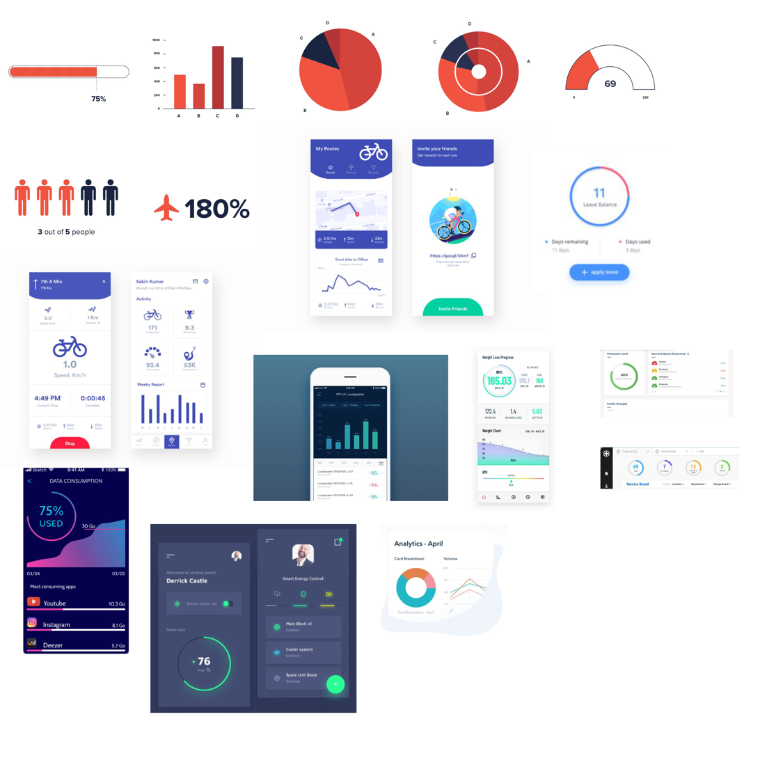
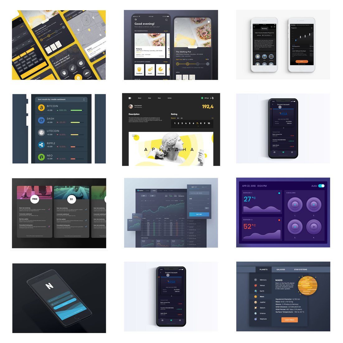
Second Look would require graphs for its scoring system, so I spent a lot of time researching different design patterns for graphs and charts. I took screenshots of these and assembled them into a mood board. This would provide a good reference for jumping into the high fidelity design work.
Logo Design
I did some sketching to show the progression of ideas for the logo and the variations between them. I was aiming for something unique but familiar enough to resemble the look and feel of other news logos. I experimented with different variations of the number 2 and the letter S to achieve the final result.
High Fidelity Screens
For the high fidelity phase, my goal was to guide the user through the process of scoring. This was achieved through a combination of chart graphs, different card-style layouts, and a brief onboarding flow.
Testing Phase
Next Steps
More usability testing needs to be performed in order to measure the efficacy of the scoring task flow and onboarding process.
Let's collaborate!
I would love to hear about a design problem you or your team are trying to solve. Feel free to drop me a line and tell me about it.
Ok, just a few quick questions.
After you introduce yourself and your project, I'll get in touch with you to schedule a time to chat. You should expect to hear from me in a day or so.