Frictionless shopping

Responsive UX/UI Design

Meijer is a super center retail chain in the midwest. They approached our company, Razorfish to lead the design effort in seamlessly transitioning their credit card customers over to a new bank.

My team's focus was on their "rewards" module, which allowed customers to easily locate their credit card points and track progress towards their spending goals.

The Challenge

Create an experience that will allow shoppers to quickly and easily access their credit card rewards on the new website

The Goal

  • Redesign rewards module for the new website so that it clearly communicates its purpose and functionality
  • Surface "benefits/perks" in order to encourage card usage in store

The Team

  • Heather Baird - Sr Experience Designer
  • Jeff Woods - Experience Designer
  • Laci Mosier - Copywriter
  • Rikki Spacey - Content Strategist
  • Ryan Hobbs - Lead Experience Designer
  • Nicolas Nguyen - Visual Designer
  • John Kolenda - Project Manager
  • Courtney Stoker - Content Strategist
  • Anne Veit - Product Manager
My Role

My role was to research competitors for inspiration and to ideate the look and behavior of the rewards module using sketches & wireframes. I also helped to document the interaction design behavior and functionality for our development team.

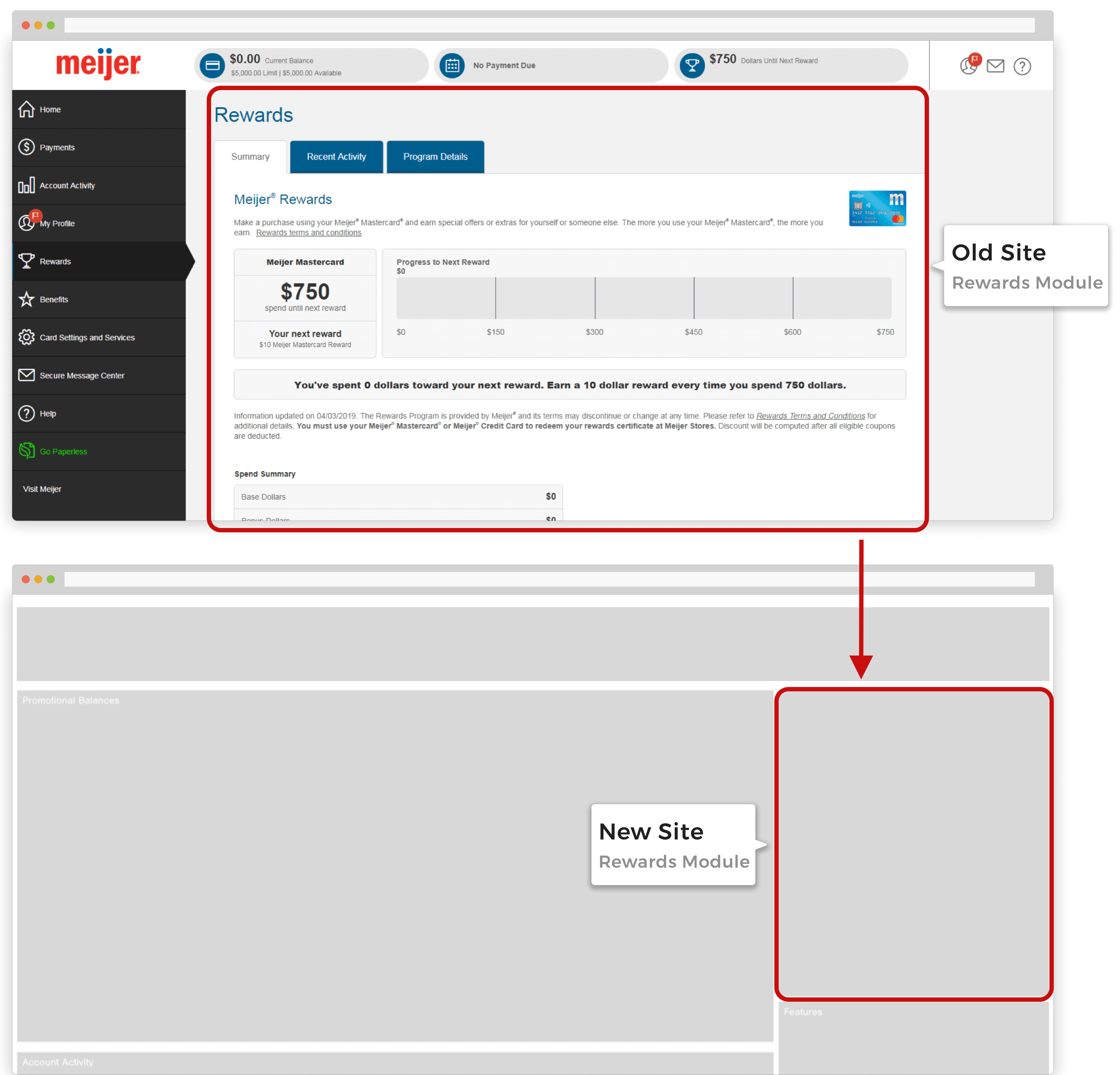
Old Experience

The old rewards module needed to be redesigned and optimized for the right rail on Citibank's website. To accomplish this, we needed to figure out how to best optimize the content to fit into our new, modular, Razorfish framework.
Who are our users?

Digital Users
  • Have the Meijer mobile app
  • Rewards are issued via barcode in Meijer mobile app
Non-Digital Users
  • Do not have Meijer mobile app
  • Enrolled in either paper or paperless options
  • Rewards are included with credit card statement in mail
Design Opportunities

Understand the different use cases and identify alternative methods for messaging our users depending on how rewards are issued and redeemed.

Ideation

Questions

Some of our users recieved their rewards digitally while others received them in the mail. We needed to design for both of these use cases while also incentivizing shoppers to use their cards when in the store. This raised a few questions:

  • How might we message our users so that they understand how and when they will be receiving their rewards and how to redeem them?
  • How might we leverage our existing messaging ecosystem so that it minimizes level of effort while providing an optimal experience?
  • How might we surface card perks in the rewards module without taking up too much space?
Leverage Existing Designs & Messaging

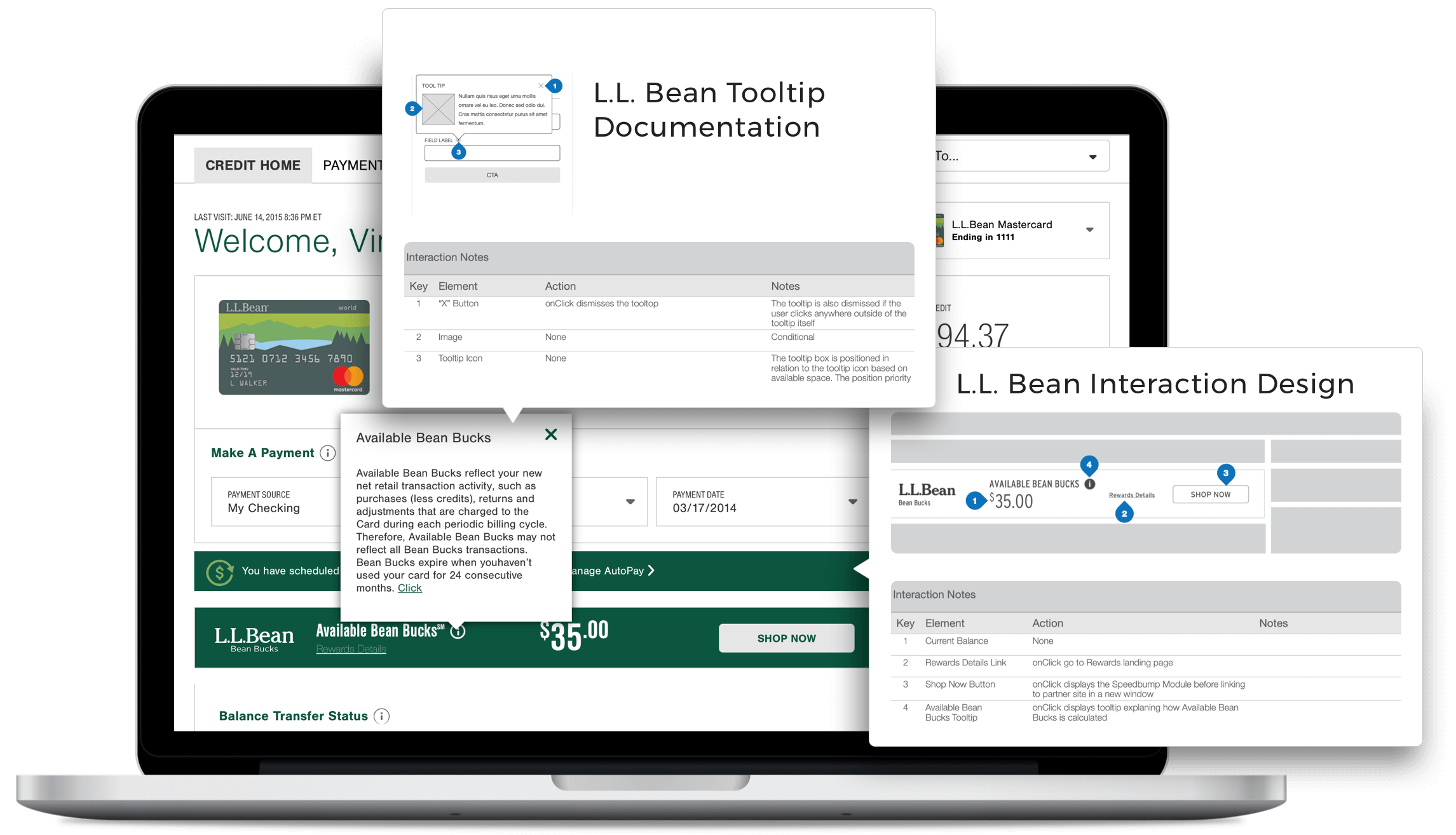
We audited similar client brands where we had built existing documentation around rewards.

L.L. Bean used interaction design and copy that we could use for our Meijer rewards module. We were able to leverage some of this documentation in order to minimize the level of effort and cost in order remain within scope.

Competitive Analysis

How might we redesign the rewards module for the new website within our existing framework?

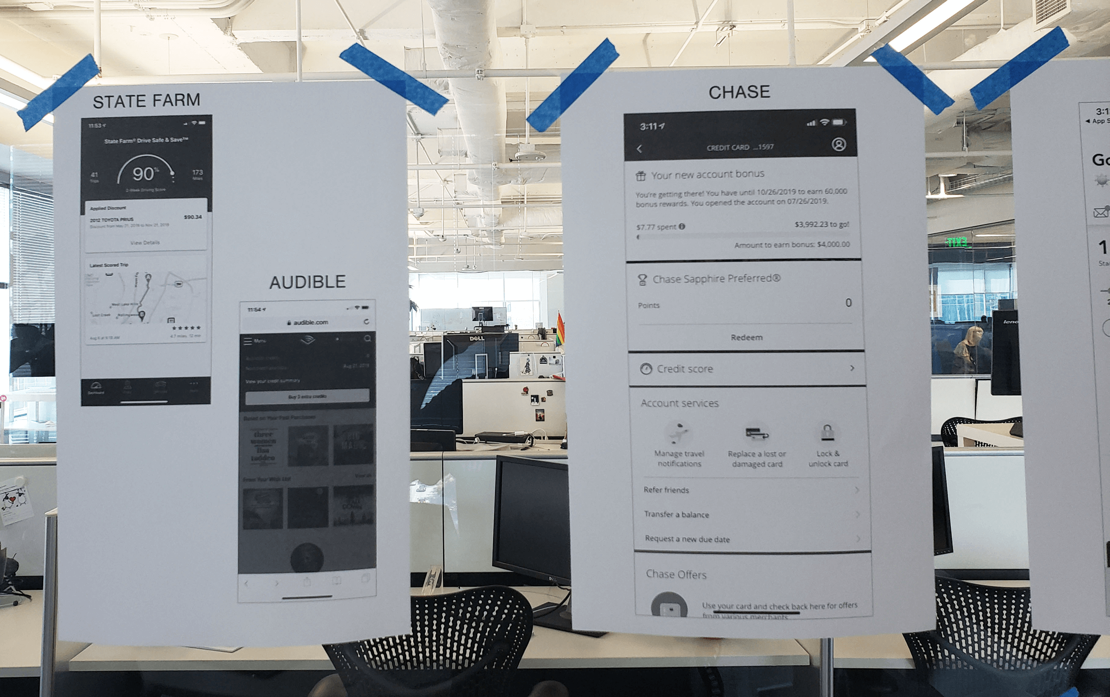
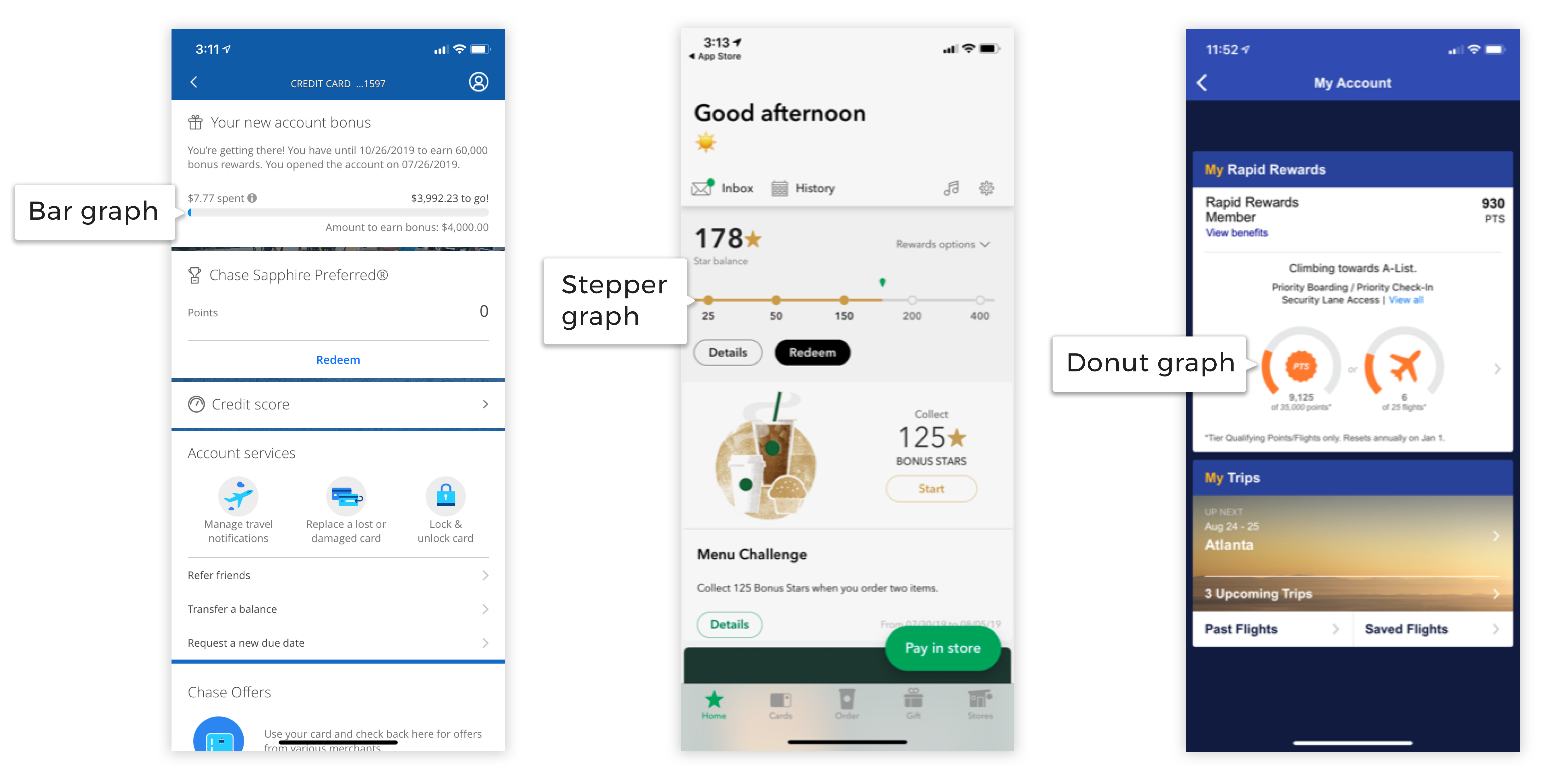
We sought inspiration from other rewards systems used by popular apps such as Chase Bank, Starbucks, State Farm, and Soutwest Airlines. Each app used different types of data visualization to indicate progress towards an earning rewards.

Whiteboarding

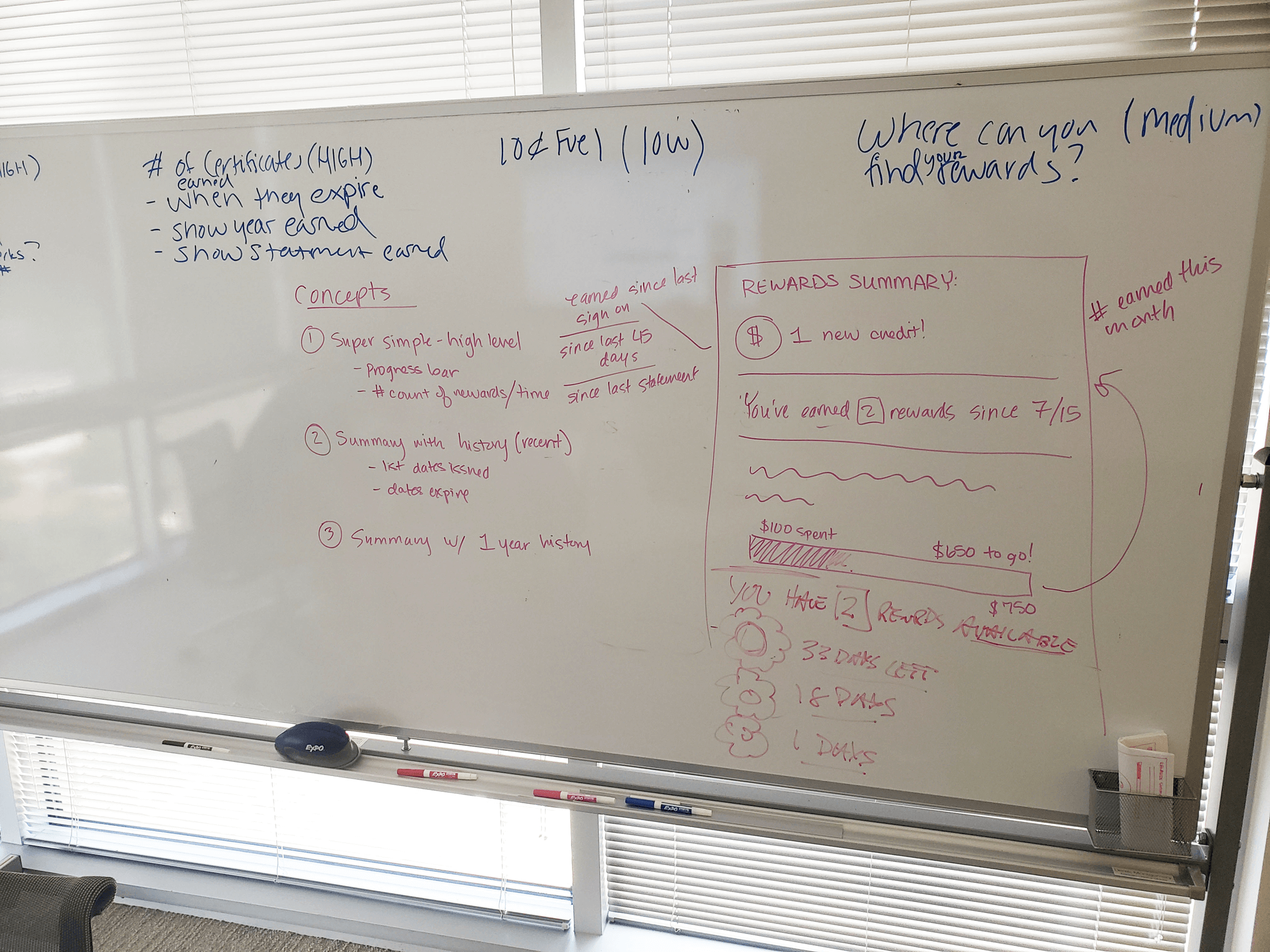
The whiteboard helped our team think through the logic and scenarios of how the rewards module would work.

Sketches

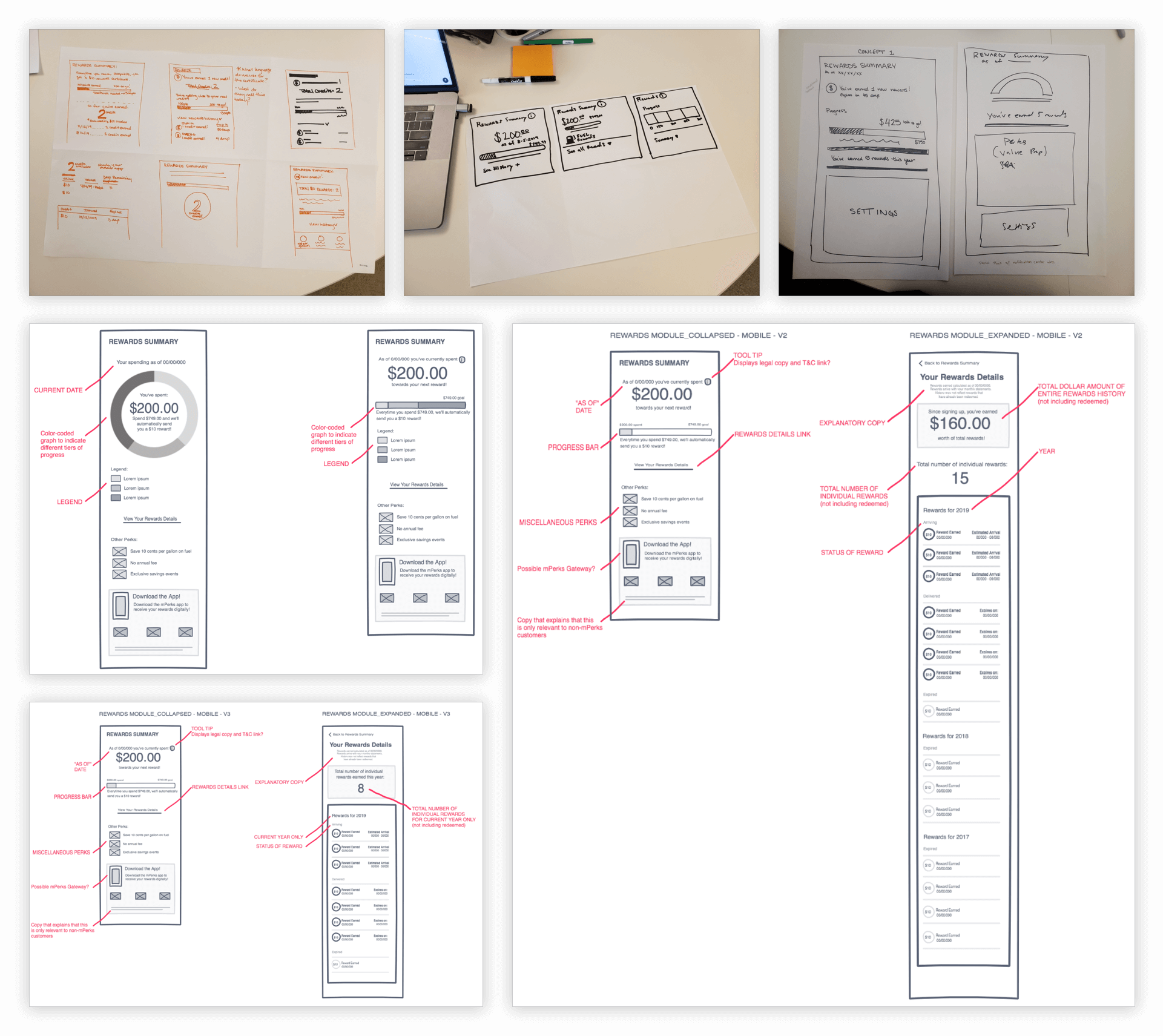
I collaborated with another designer to create some rough sketches and then refined them using InVision's Freehand tool.

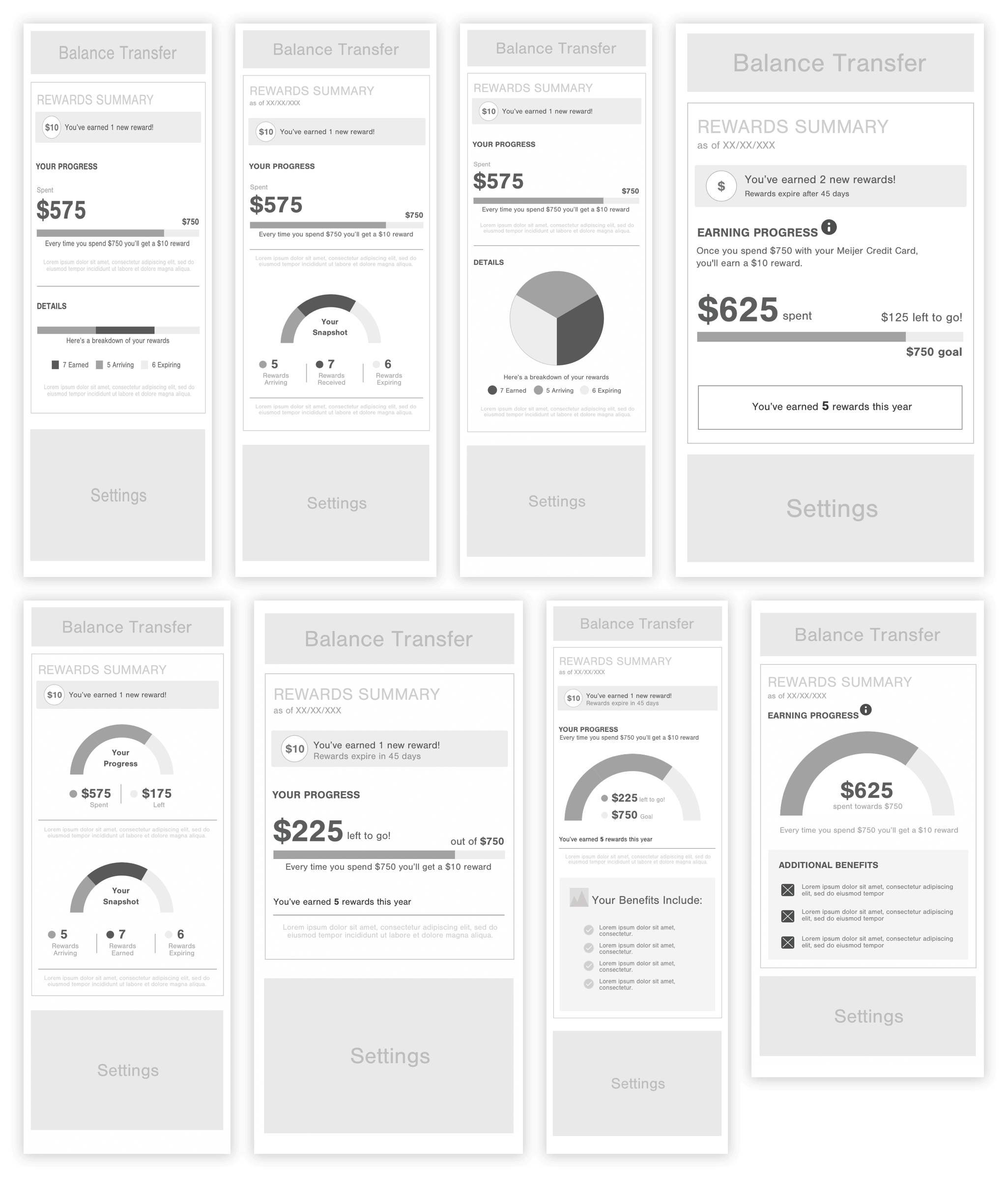
Wireframes

To further refine our concepts, we used Sketch to create higher-fidelity wireframes to represent different design treatments. Ultimately, we decided that a single "arch" graph was the optimal solution for visualizing progress towards a goal.

High Fidelity Design

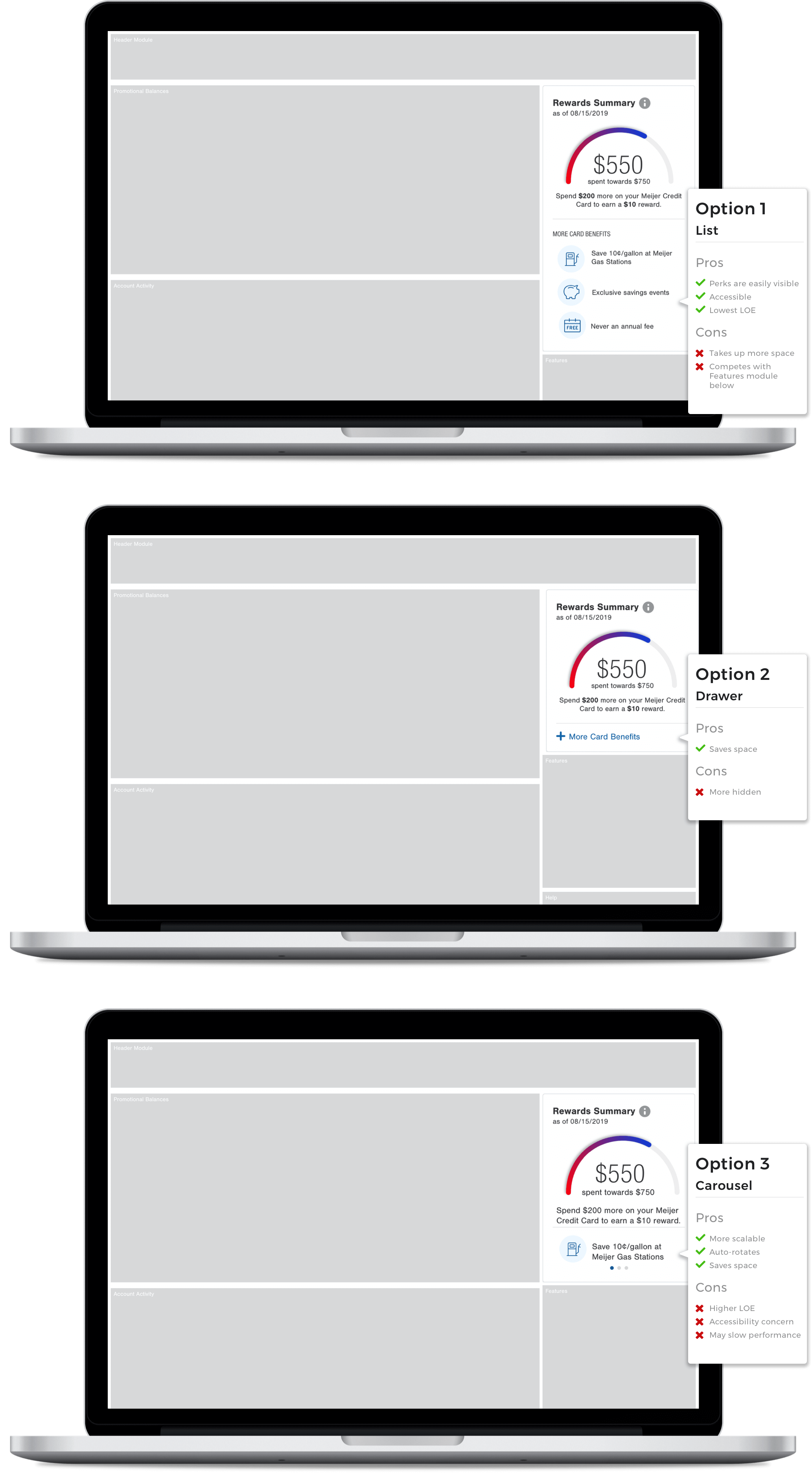
Considering Our Options

Surfacing the card "perks" was one of the asks from Citibank so we presented three different design options to our stakeholders. After some back and forth, we decided to go with the carousel (option 3).

MVP Design

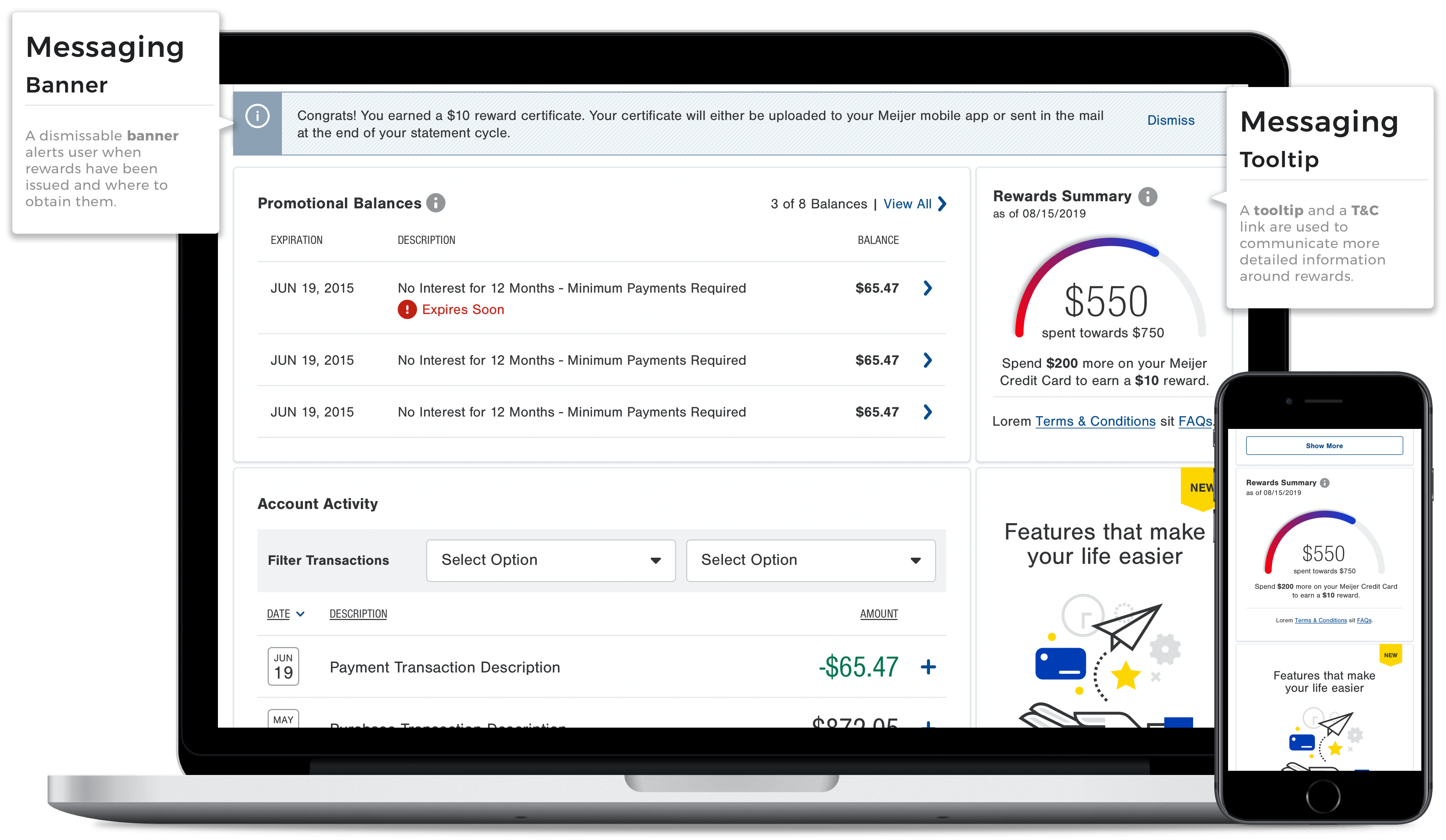
Our MVP design was a tradeoff between being able to save real estate without having to sacrifice the most important information about rewards for our users. There were too many concerns around the length of the module, accessibility, responsive performance, & the level of effort required to support the perks section. Ultimately, it was removed and placed into the backlog. We also surfaced the T&C and FAQ links to be compliant with legal. A banner message and a tooltip were also used to communicate important information around rewards.

Takeaways

I wasn't around for the final launch of the Meijer Rewards Module but I learned a few valuable things along the way:

  • The final design is not necessarily the most desirable. In order to meet our deadlines, tradeoffs were necessary and that's ok.
  • Having a robust design and documentation ecosystem is nice. This freed up our time to focus most of our efforts on ideation and quick iteration.
  • Data visualization is hard! I am grateful to have worked with so many smart people on this project. They helped us translate the functionality of the rewards graph into a language that our developers could easily understand and build.